


The 65-character rule: Why line length matters in Word and PowerPoint
to your Office files.
If this article has made you rethink how your business uses Word, Excel or PowerPoint, ZOARC Creative can help create polished, brand-aligned templates for letterheads, reports, proposals, bids and presentations.


Trusted for Microsoft Office template and formatting support
Have you ever opened a document or presentation that looked perfectly professional, but somehow felt tiring to read?
The branding may be right. The font may be familiar. The headings may be clear. Yet after a few paragraphs or slides, you find yourself losing your place, rereading the same line or simply skimming rather than properly taking in the information.
The problem may not be the font itself.
It may be the line length.
Line length – sometimes referred to as the measure in typography – is simply the width of a block of text and, more specifically, how many characters sit on each line.
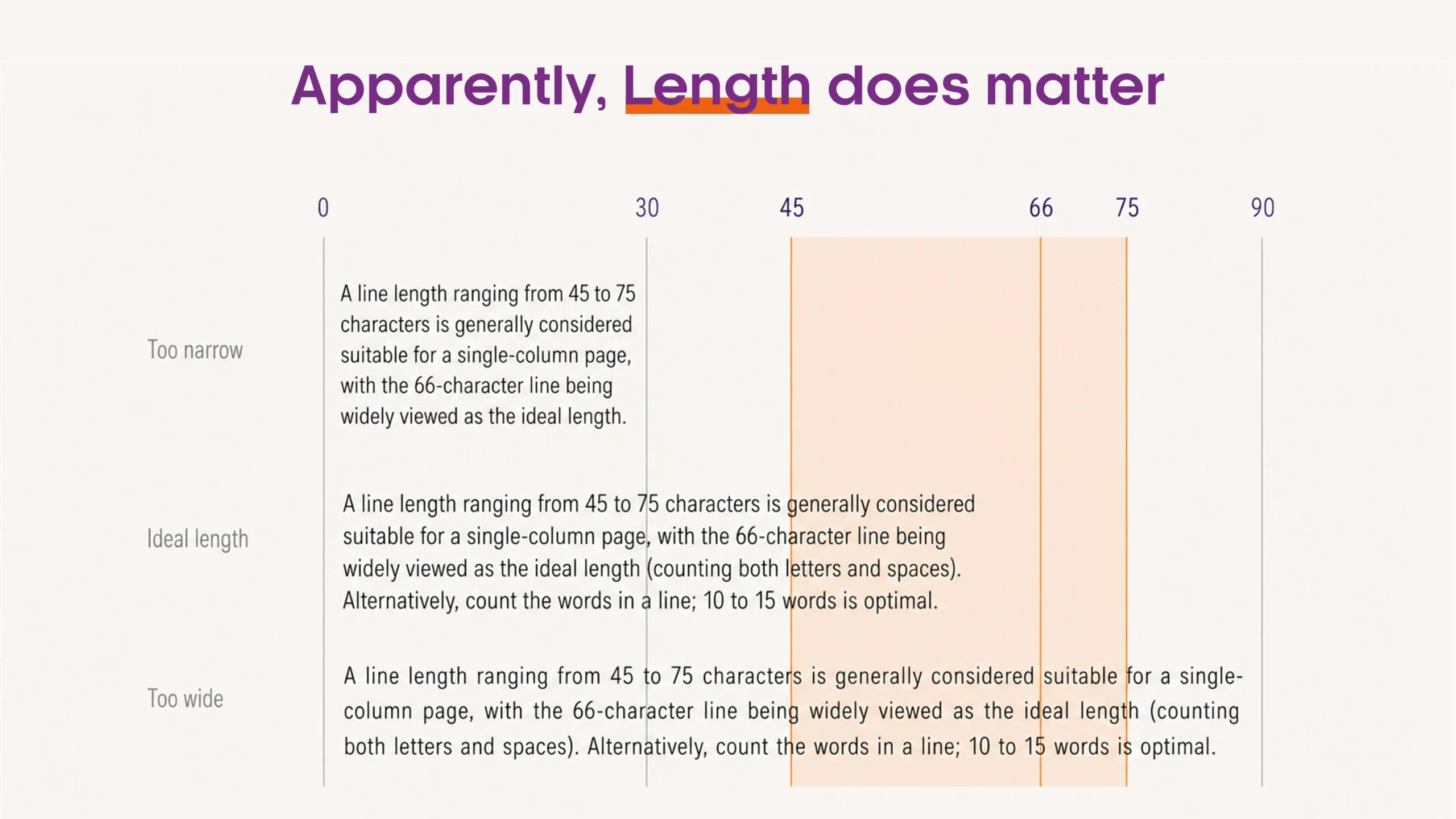
One long-standing principle of typography is that a line of around 65 characters, including spaces, is comfortable to read.
A simple visual way of thinking about this is approximately:
Two and a half alphabets.
abcdefghijklmnopqrstuvwxyzabcdefghijklmnopqrstuvwxyzabcdefghijklm
It is not a rigid rule, but it provides a useful reference point when designing both Microsoft Word documents and PowerPoint presentations.
Good typography should make reading feel effortless. If the reader is consciously working to follow the text, the layout may already be getting in the way.
When we read, our eyes do not move continuously from left to right. They make a series of small movements across the text and, at the end of each line, return to the beginning of the next.
When lines become very long, finding the correct starting point of the following line becomes more difficult. Readers can lose their place, reread a line or skip one altogether.
Research by Mary Dyson and Mark Haselgrove examined the effect of different line lengths when reading from a screen. Their study found that a medium line length of around 55 characters supported effective reading and produced the highest comprehension in their experiment.
Usability research from the Baymard Institute recommends a slightly wider range of approximately 50–75 characters per line for body text. Its research also found that very long lines can make text appear more intimidating and difficult to follow.
Think of 65 characters as a useful target, not a fixed rule. In practice, a range of around 50–75 characters per line is a good reference for continuous body text.
There is an accessibility consideration too.
The Web Content Accessibility Guidelines include line width within their guidance on the visual presentation of text. At Level AAA, they specify that users should be able to limit blocks of text to no more than 80 characters or glyphs per line.
The supporting guidance explains that long lines can make it harder for some people with reading, visual or cognitive disabilities to keep their place and follow the flow of text.
This is an important distinction.
Good typography should not simply make something look polished. It should make information easier to consume.
What does this mean in Microsoft Word?
In Word, line length is determined by several things working together:
- page size;
- left and right margins;
- typeface;
- font size; and
- whether the content uses a single or multi-column layout.
This is why applying a standard font size or margin measurement in isolation does not necessarily guarantee comfortable reading.
Different typefaces occupy different amounts of horizontal space. A paragraph set in one font at 11 point may have a noticeably different line length from another font at exactly the same size.
When developing a Word template, it is therefore worth looking at the actual width of the body text, rather than simply accepting the default page setup.
The two-and-a-half-alphabets test is a useful quick check. It does not need to be scientifically precise. If your body copy stretches considerably beyond it, consider whether the margins, font size or layout could be adjusted.
This becomes particularly important in landscape documents.
A landscape page provides a large amount of horizontal space, but that does not mean all of it should be filled with one continuous paragraph.
This is one reason newspapers, magazines and editorial publications use columns. Columns are not simply decorative: they help control line length and make continuous text easier to follow.
For a landscape Word document, that might mean using wider margins, restricting body copy to a narrower content area, or dividing longer content into columns.
The objective should not always be to fit the maximum amount of information onto a page.
It should be to make that information easy to read.
What about PowerPoint?
The same principle is often overlooked in presentations.
PowerPoint slides are landscape by default, yet it is common to see paragraphs stretched across most of the available slide width.
Technically, the text fits.
Typographically, that does not necessarily mean it works.
There is another consideration with presentations: the audience is usually reading from much further away than someone reading a Word document.
A person may be looking at a projected screen, a meeting-room display or even a shared presentation during a video call.
If text only fits because it stretches across the entire slide, the problem may be the layout rather than the font size.
Instead of automatically reducing the font size, consider changing the structure of the slide.
A long paragraph might work better as a narrower text column, two shorter content areas, a key message with supporting information, a diagram, or even two separate slides.
This is where white space becomes important.
White space is not wasted space. It helps separate information, establishes hierarchy and gives the audience a clearer path through the content.
Good typography is about more than choosing a font
When organisations think about typography, the conversation often begins with the brand typeface.
But readability comes from the relationship between font size, line length, line spacing, paragraph spacing, margins and white space.
A Word template or PowerPoint presentation can follow every brand guideline perfectly and still be difficult to read.
Equally, a relatively small adjustment to the width of a text area can make a page or slide feel noticeably more comfortable without the reader ever consciously understanding why.
That is what good typography should do.
It should not draw attention to itself.
It should make the message easier to understand.
So, the next time you are working on a Word document or PowerPoint presentation, try the two-and-a-half-alphabets test.
You might be surprised by how long your lines really are.
The best templates do more than look consistent. They make information easier to create, navigate and understand.
If your Word or PowerPoint templates look on-brand but still feel difficult to read or inconsistent in use, the issue may be in the underlying typography, spacing or layout structure.
At ZOARC Creative, we design and develop Microsoft Office templates with both brand consistency and usability in mind, so documents and presentations are not only visually aligned but also easier for users and audiences to read.
Get in touch with us and we would be happy to review your existing Word or PowerPoint templates and recommend where the typography, layout or template structure could be improved.
Explore more...

- ±9 minutes read

- ±7 minutes read
- ±5 minutes read
- ±6 minutes read

- ±5 minutes read

- ±10 minutes read