


How to make a Word document accessible: A practical guide
to your Office files.
If this article has made you rethink how your business uses Word, Excel or PowerPoint, ZOARC Creative can help create polished, brand-aligned templates for letterheads, reports, proposals, bids and presentations.


Trusted for Microsoft Office template and formatting support
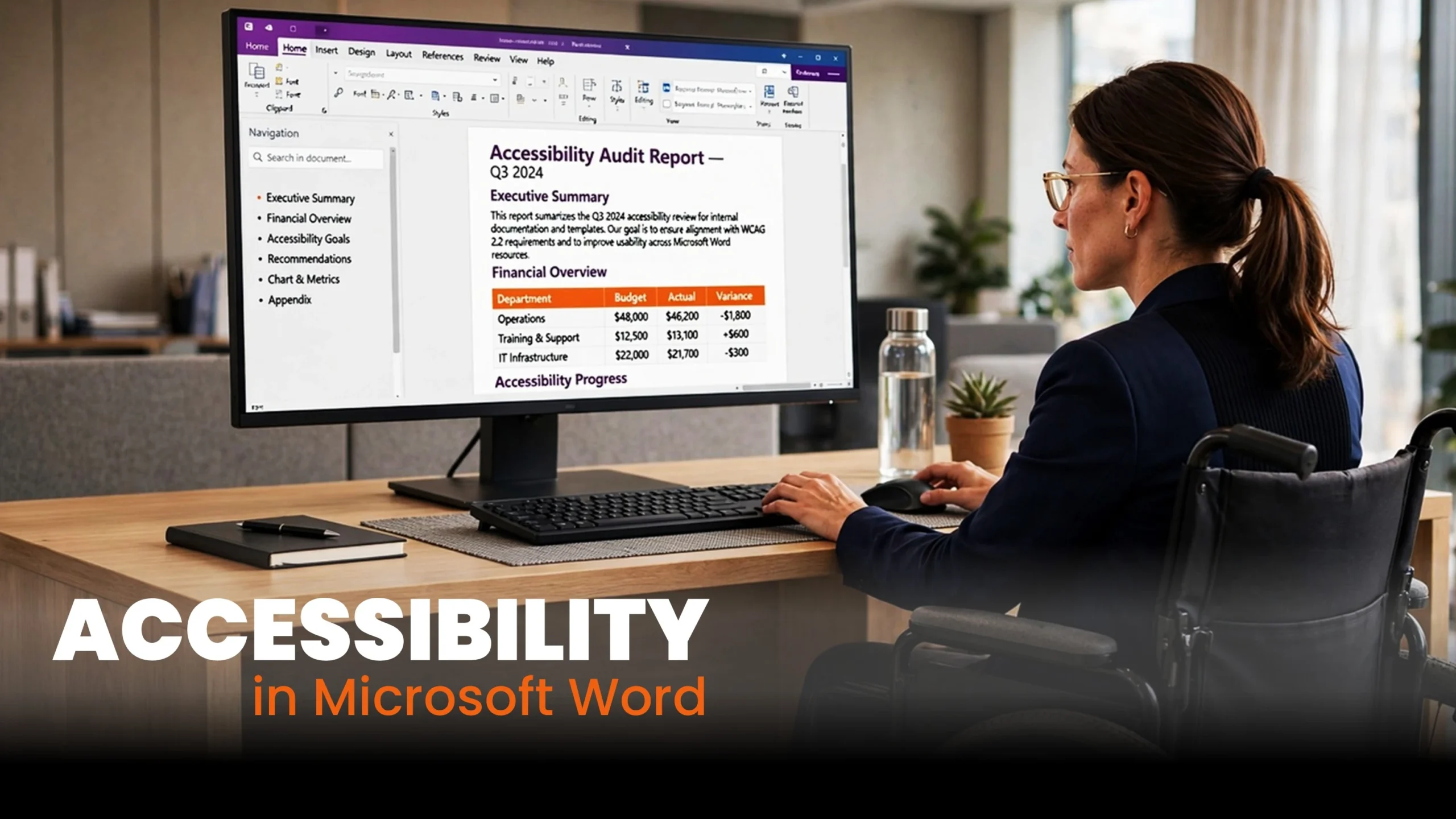
You have finished a proposal, checked the spelling and made sure every page looks right. The headings are bold, the tables fit and the colours match your brand.
Then a colleague using a screen reader tries to find the recommendations. The headings are not recognised, the table is difficult to follow and several links are announced simply as “click here”.
The document looks organised, but using it tells a different story.
Making a Word document accessible means considering how people find, read and understand its content. That includes people using assistive technology, people with low vision and readers who find dense layouts difficult to process.
You do not need to redesign every document from scratch. Start with the structure, then work through the content.
A document can look beautifully organised and still be difficult to navigate. Accessibility depends on what sits behind the formatting.
Give your document a structure people can use
Imagine opening a 40-page report and having to work through every paragraph to find one section. That is the problem a reader can face when headings have only been made larger or bold.
Use Word’s heading styles instead. Select the heading text, go to Home > Styles and apply the appropriate level. Heading 1 identifies a main section; Heading 2 identifies a subsection within it.
Choose levels according to the relationship between sections, rather than whichever style happens to look best. The appearance of each style can be adjusted to match your branding.
Open the Navigation Pane and review the heading list. Does it provide a useful outline? Would “Findings from customer interviews” tell the reader more than “Overview”?
For a fuller explanation of how this works, read our guide to Word styles.
Apply the same thinking to lists. Use Word’s bullet and numbering tools rather than typing symbols and aligning them with spaces.
A useful test is to ask whether the document would still make sense if its visual styling disappeared.
Make tables, images and links easier to understand
A pricing table might be straightforward to its author but confusing to somebody encountering it for the first time. What does each column contain? Is the figure a monthly cost, an annual cost or a percentage?
Keep tables simple, use clear column headings and identify the header row in Word. Avoid merged, split or nested cells where a simpler arrangement would work. Use tables for related data rather than as a way to position everything on the page.
For long tables, set the header row to repeat across pages. That also helps someone reading a printed copy who would otherwise have to turn back to check a column label.
Images need similar attention. Alternative text, often called alt text, explains the information or purpose that a reader would otherwise miss.
For example, “bar chart” tells the reader very little. “Customer satisfaction increased from 72% to 86% between January and June” explains the finding. If the detailed values matter, provide them in accessible text or a suitable table as well.
Purely decorative images can be marked as decorative where Word provides that option. Review automatically generated descriptions before keeping them: recognising the objects in a photograph does not necessarily explain why the photograph is in your report.
Links should also make sense outside the sentence around them. Replace “click here” with a description such as “download the employee expenses policy”.
Describe the information the reader needs, rather than simply naming the object on the page.
Make reading comfortable, then check the finished file
Accessibility also affects people who read the page visually.
Picture a client opening your proposal on a small laptop. Pale grey text, tightly packed paragraphs and long lines can make a short document feel exhausting.
Use clear language, descriptive headings and enough space between paragraphs. Avoid shrinking text simply to keep a report within an arbitrary page count. Check text against its background, including coloured table cells and text placed over photographs.
Our article on why line length matters in Word and PowerPoint explores how text width affects reading comfort.
Do not rely on colour alone. In a project status table, write “Delayed” or “On track” rather than expecting readers to interpret red and green cells.
For documents shared internationally, set the correct proofing language and identify passages written in another language where appropriate. This can help assistive technology pronounce the content correctly.
Before sharing, run Word’s Accessibility Checker, commonly available through Review > Check Accessibility. Menu names vary between versions. Work through the findings, but also read the document yourself: an automated check cannot decide whether your explanation is clear or an image description is useful.
If you supply a PDF, use an export option that preserves accessibility tags and check that file separately. Avoid assuming that a document is accessible simply because it has been converted to PDF.
The Word file and its exported PDF both need checking. A change of file format does not repair the source document.
If the same problems appear in every report, review the template. A well-developed Word template can provide structured styles, sensible table conventions and readable layouts, reducing the work each author has to repeat. Authors still need to add meaningful content and check the finished document.
Our article on digital accessibility in Word and PowerPoint explains the wider context behind this approach.
Working with presentations too? In our next article, we explore how to make PowerPoint presentations accessible, from slide reading order to charts, captions and shared files.
At ZOARC Creative, we design and develop Word templates that bring branding, document structure and everyday usability together. If your team needs help reviewing an existing report or building a more accessible template, start the conversation.
Explore more...
- ±5 minutes read

- ±6 minutes read

- ±9 minutes read

- ±7 minutes read
- ±5 minutes read

- ±5 minutes read