

Worth a read


Digital accessibility does not stop at websites. Word documents, PowerPoint presentations, Excel workbooks and PDFs can also create barriers, making the underlying Microsoft Office template an important place to begin.
- ±9 minutes read

Designing PowerPoint presentations for events
- ±7 minutes read
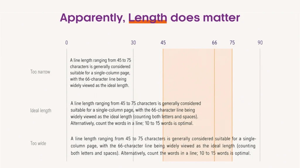
Why can a well-designed document
- ±5 minutes read
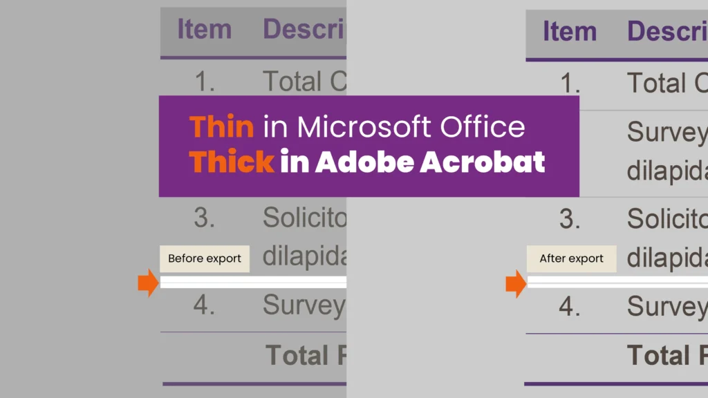
Thin table borders and shape
- ±6 minutes read
Explore topics

Digital accessibility does not stop at websites. Word documents, PowerPoint presentations, Excel....
- ±9 minutes read

Designing PowerPoint presentations for events requires more than making everything bigger. Discover....
- ±7 minutes read
Why can a well-designed document or presentation still feel difficult to read?....
- ±5 minutes read
Thin table borders and shape outlines can appear unexpectedly heavy after exporting....
- ±6 minutes read
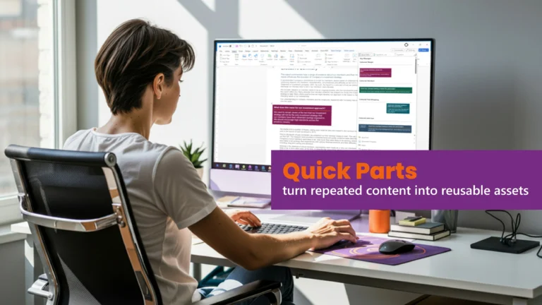
Quick Parts in Word is one of Microsoft Word’s most overlooked productivity....
- ±5 minutes read

Bespoke fonts can strengthen branding, but they also introduce risk in Word....
- ±10 minutes read