


How to make PowerPoint presentations accessible: A practical guide
to your Office files.
If this article has made you rethink how your business uses Word, Excel or PowerPoint, ZOARC Creative can help create polished, brand-aligned templates for letterheads, reports, proposals, bids and presentations.


Trusted for Microsoft Office template and formatting support
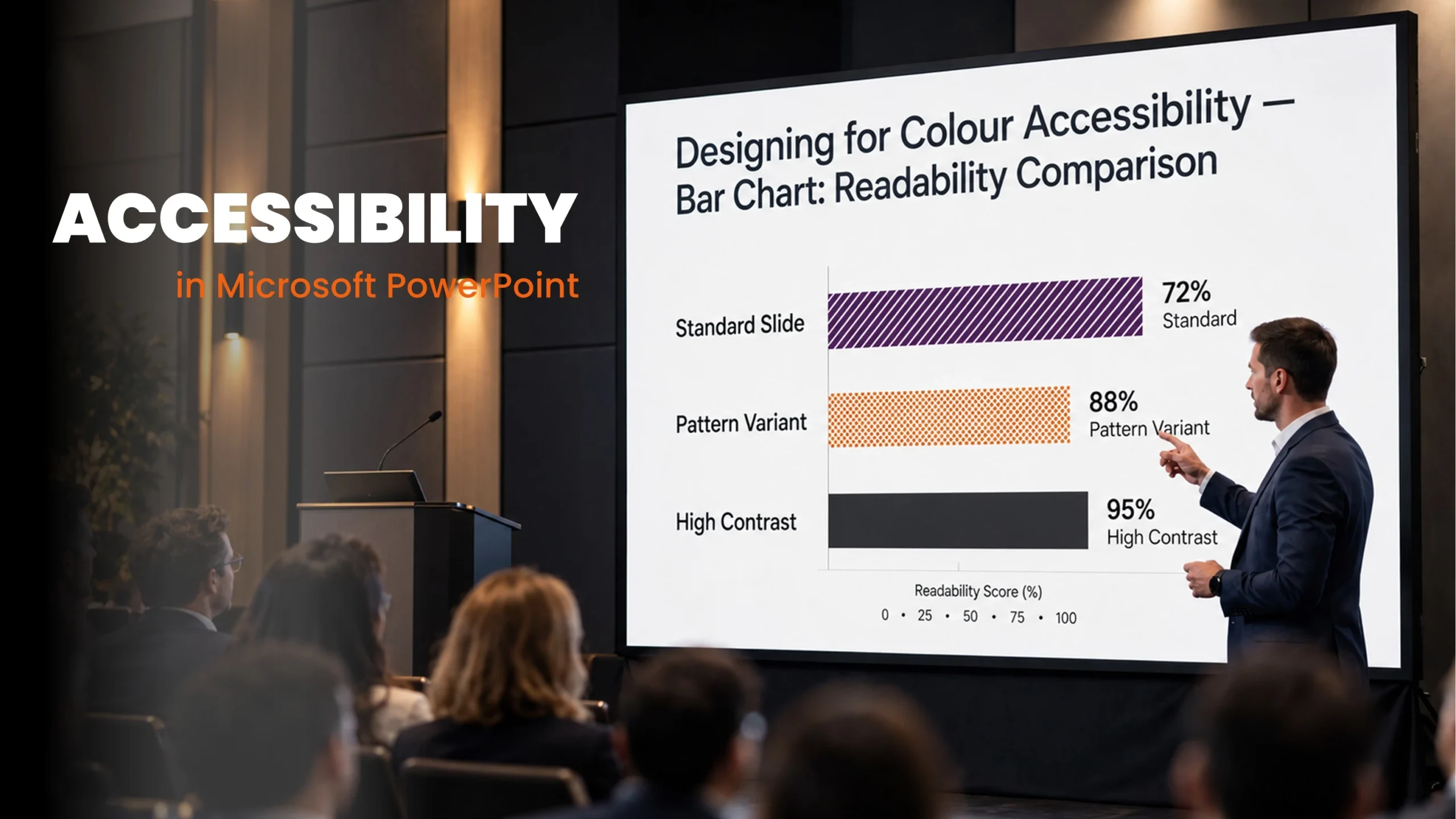
During a meeting, your presentation seems to work well. You explain the chart, point to the figures and talk everyone through the next steps.
Later, you email the slides to the wider team.
Someone reading them independently cannot tell what the red and green indicators mean. Another person using a screen reader hears the footer before the slide title. A colleague watching the recording misses part of the message because the video has no captions.
These are everyday presentation problems. They can affect a sales pitch, staff training session, university lecture or board update.
Making PowerPoint accessible means thinking about both experiences: following the presentation live and using the file afterwards.
Your presentation needs to make sense when you are no longer there to explain it.
Start with titles, layouts and reading order
A slide can look logical while its contents are read in a completely different sequence.
Imagine a slide containing a heading, three steps and a closing recommendation. Visually, the path is obvious. Through a screen reader, the recommendation might arrive first, followed by step three and then the heading.
Use a properly constructed slide layout with title and content placeholders as your starting point. Give each slide a descriptive title. “Three reasons delivery costs increased” offers more context than “Update”.
If several slides discuss the same subject, distinguish their titles so readers can identify them individually.
Then check the object sequence. In supported desktop versions, open the Reading Order Pane, usually through Review > Check Accessibility, and arrange meaningful objects in the order they should be understood. The controls available vary by platform and version.
Adding a text box or copying a diagram from another presentation can affect the sequence, so check again after substantial edits.
A template can provide a sensible starting order, but it cannot anticipate every object an author will add.
Explain what your visuals are telling people
A chart should communicate more than a pattern of colours.
Suppose a regional performance slide uses green for markets above target and red for those below it. Someone who cannot distinguish those colours may lose the entire message.
Add labels, values or another clear distinction. Use a title that states the main finding, such as “Four regions exceeded their annual target”.
Our article on turning business charts into a clear message explores how to make the point easier to find.
Provide useful alternative text for meaningful visuals. For a process diagram, explain the sequence or relationship. For a chart, summarise the finding and make essential detailed data available in a suitable supporting format.
Avoid descriptions such as “image of a chart” when the reader needs to know what the chart demonstrates. Equally, do not squeeze a complicated explanation into one enormous description; consider a separate text explanation or accessible supporting document.
Mark purely decorative objects as decorative where the controls allow it. Background flourishes should not interrupt the message.
If colour, position or an image carries essential information, provide another way to understand it.
Consider the room, the recording and the shared file
A slide that looks comfortable on your monitor may be difficult to read from the back of a training room.
Use a clear visual hierarchy, readable text and sufficient contrast. When a slide feels crowded, consider splitting it into two rather than reducing every font size.
This is particularly important for charts and tables. Enlarging the title does little to help if the labels remain too small to read.
We discuss viewing distance and the event environment in designing PowerPoint presentations for events and large screens.
Think about how you speak as well. “The figure on the right shows the problem” gives little help to somebody who cannot see it. “Delivery costs rose by 18%, mainly because of transport charges” communicates the finding directly.
For video, include accurate captions covering speech and meaningful sounds. Where important information is shown without being spoken, provide an equivalent explanation. PowerPoint’s support for media captions depends on the version and platform, so test playback in the environment your audience will use.
Live subtitles may help during a presentation, but they do not replace checked captions for a prerecorded video. Names, specialist terms and accents can all affect automatic transcription.
Use animation with a clear purpose. Avoid flashing effects and sequences that move on before people have time to read. If the explanation depends on objects appearing one at a time, consider whether the slide still makes sense in the shared file or printed handout.
Accessibility includes the live experience, the recording and the document people take away.
Before distributing the presentation, run Check Accessibility and review the results. Then make your own checks: are the titles helpful, does the content follow a sensible sequence, and can someone understand the main points without relying on colour?
Where possible, include testing with assistive technology and feedback from the people who will use the presentation. Passing an automated check alone does not establish that every barrier has been removed.
Check exported PDFs separately too. A PDF will not preserve the experience of animation or video, and it still needs appropriate structure and accessibility review.
Our existing article on digital accessibility in Word and PowerPoint explains why these decisions should begin with the template.
A well-developed PowerPoint template can give your team useful layouts, consistent title placeholders and considered reading order. Combined with practical guidance, it creates a stronger foundation for the presentations they build next.
In our previous article, we explored how to make a Word document accessible. Many of the same principles apply to PowerPoint, but presentations introduce additional challenges, including slide reading order, visual content and the live presentation experience.
At ZOARC Creative, we design and develop PowerPoint templates with brand consistency and usability in mind. If your presentations need clearer layouts, better structure or an accessibility-focused review, start the conversation.
Explore more...

- ±5 minutes read

- ±6 minutes read

- ±9 minutes read

- ±7 minutes read
- ±5 minutes read

- ±5 minutes read