


Designing PowerPoint presentations for events and large screens: 12 things to consider
to your Office files.
If this article has made you rethink how your business uses Word, Excel or PowerPoint, ZOARC Creative can help create polished, brand-aligned templates for letterheads, reports, proposals, bids and presentations.


Trusted for Microsoft Office template and formatting support
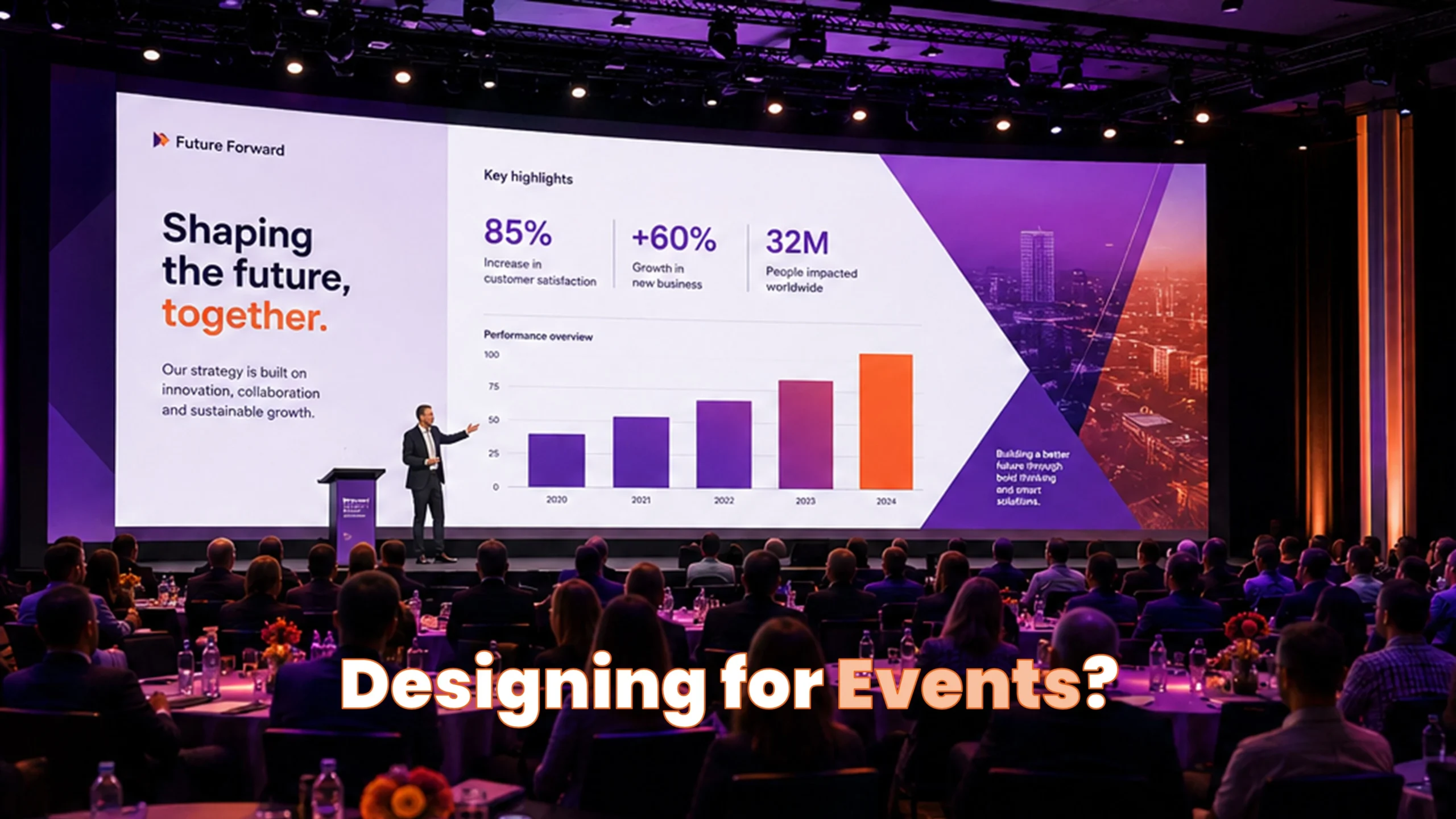
A PowerPoint presentation that works perfectly in a meeting room does not necessarily work on a conference stage. When presentations are shown on large screens, LED walls or in auditoriums, viewing distance, screen technology, stage lighting and the event environment all influence how effectively the slides communicate.
Designing for an event therefore requires more than simply making everything bigger. Here are 12 things to consider when designing a PowerPoint presentation for an event or large screen.
1. Start with the screen specification
Before opening PowerPoint, establish how and where the presentation will actually be displayed. Screen proportions at events can vary considerably, particularly when custom LED walls are being used.
Do not assume 16:9. Ask the event production team for the screen dimensions, native pixel resolution and, where available, the screen or pixel map.
Also establish whether PowerPoint will occupy the entire display or only part of it, whether other content such as live camera feeds or event branding will share the screen, and whether the presentation will run directly from PowerPoint or through production software. Getting this information at the beginning can prevent substantial redesign later.
2. Design for the person at the back of the room
Text that looks perfectly comfortable on a laptop can become extremely difficult to read from the back of an auditorium. Viewing distance should therefore influence typography and the amount of information placed on each slide.
A bigger screen does not mean more information. In most cases, it means bigger typography and less information.
For event presentations, body text may need to be around 32–40 pt or larger, with headings and key statements considerably larger depending on the venue. Rather than treating these as fixed rules, test the presentation at a realistic viewing distance and make sure the principal message remains immediately clear.
3. Reduce the amount of information on each slide
Event slides should support the presenter rather than compete with them. If the audience is busy reading several paragraphs from the screen, they are probably no longer listening to what is being said on stage.
One slide. One principal message. Let the presenter provide the detail.
Turn important findings into strong statements, statistics or simple visual stories wherever possible. Detailed explanations can remain in speaker notes, supplementary material or a separate document intended to be read after the event.
4. Use strong contrast and avoid delicate design
Venue lighting, LED technology, projection and screen calibration can all change how colours and fine graphical elements appear compared with your own monitor.
If an element is only just visible on your monitor, assume it may disappear on the event screen
Use strong tonal contrast for important information and be cautious with pale colours, very thin rules, lightweight icons and delicate typefaces. Event presentation design can still be refined and sophisticated, but important elements need sufficient visual weight to remain clear at scale.
5. Simplify charts and data visualisation
A chart designed for a report or board presentation can contain far too much information for an audience viewing it for only a few seconds.
Before designing the chart, ask: what is the one thing the audience needs to understand?
Remove unnecessary gridlines, legends, labels and data series wherever possible. Highlight the important value or trend and consider making the conclusion itself the slide headline. A successful event chart should communicate its principal message within a few seconds.
6. Establish a safe area for important content
Important information should not sit directly against the edges of the presentation. Different production systems can introduce cropping or masking, particularly with bespoke LED installations.
Keep titles, logos and critical information comfortably within an agreed safe area.
For reusable event PowerPoint templates, safe areas can be established using guides within the template so users have a consistent framework for positioning content. This reduces the risk of important information ending up too close to the physical or technical boundaries of the display.
7. Consider where the presenter will stand
The presentation is part of a physical stage environment. A presenter, lectern or other stage element can obscure surprisingly large areas of the screen.
Design around the stage as well as the screen.
Where possible, obtain the stage layout and understand where the presenter, lectern, confidence monitors and cameras will be positioned. For some events it can be useful to establish an informal presenter exclusion zone within the slide so important information is not repeatedly hidden behind the speaker.
8. Use high-quality images and media
Large screens expose poor-quality imagery very quickly. An image that appears acceptable inside a normal PowerPoint window can look noticeably pixelated when enlarged across an event screen.
Always design with the final display size in mind when selecting photography, graphics and video.
Use sufficiently high-resolution source images and avoid unnecessarily compressed files. PowerPoint’s image compression settings should also be checked before delivery. For video, confirm resolution, aspect ratio, playback format and audio requirements with the production team, and provide important video files separately as a backup.
9. Check fonts on the event computer
Custom brand fonts can create problems when a presentation is transferred from the designer’s computer to the machine being used at the event.
Never assume your corporate font will be available on the event computer.
Depending on licensing and technical requirements, fonts may need to be installed on the event machine, embedded within the PowerPoint file or replaced with an approved fallback. Font compatibility should be checked before the event rather than discovered during the final rehearsal.
10. Use animation with purpose
Animation can be particularly effective on stage because it allows the presenter to control when information appears and helps direct the audience’s attention.
Animation should help tell the story, not simply decorate the slide.
Progressive reveals, simple fades and carefully planned builds can work extremely well. Complicated animation should be used cautiously, particularly when presentations are being passed through different computers or production systems. Reliability should always take priority over unnecessary visual effects.
11. Always prepare a backup
Live events leave very little room for technical problems, so the PowerPoint presentation should never be the only version available.
If the presentation matters enough to put on a stage, it matters enough to have a backup.
Alongside the final PowerPoint file, consider supplying a PDF backup, separate copies of important video and audio files, and any required fonts where licensing permits. For critical animated sequences, a pre-rendered video can sometimes provide an additional fallback if playback or animation fails.
12. Test the presentation on the actual event system
A presentation can be technically perfect on the designer’s computer and still behave differently once connected to the venue’s production system.
The final quality check should happen on the screen the audience will actually see.
Whenever possible, test the presentation using the actual event computer, display and production setup. Check typography, contrast, cropping, colours, images, video, animation and audio, then view the presentation from different parts of the room. The back row is often a much better place to judge an event presentation than the production desk.
Designing for the room, not just the slide
Ultimately, a successful event presentation needs to be designed as part of the wider event environment. The screen, stage, presenter, audience, lighting, cameras and production system all influence how the presentation performs. This does not necessarily mean creating an entirely separate brand or PowerPoint template for every event, but it may mean adapting an existing corporate presentation system with larger typography, stronger contrast, simplified content, appropriate animation and layouts designed specifically for large-screen use.
How ZOARC Creative can help
At ZOARC Creative, we specialise in the design and development of professional PowerPoint presentations and templates, combining strong visual design with an in-depth understanding of how PowerPoint actually works.
For conferences, corporate events and large-screen presentations, we can help adapt an existing presentation or develop an event-specific PowerPoint system that considers screen dimensions, content hierarchy, typography, imagery, charts, safe areas and the practical requirements of presenting on stage. Where appropriate, we can also incorporate PowerPoint animation and transitions to control how information is revealed and help presenters tell their story more effectively.
Because our work extends beyond presentation design into PowerPoint template development, we can also build reusable layouts and functionality into the template itself. This allows internal teams to continue creating event-ready presentations while maintaining brand consistency and reducing the risk of slides being incorrectly formatted.
Whether you need support developing a PowerPoint template for an event, adapting an existing corporate presentation for a large screen, or designing and animating the presentation itself, ZOARC Creative can help ensure the final presentation is both visually effective and technically considered.
Planning a presentation for an upcoming conference or event?
Get in touch with ZOARC Creative to discuss your PowerPoint presentation, template or animation requirements.
Explore more...

- ±6 minutes read
- ±9 minutes read
- ±5 minutes read
- ±5 minutes read
- ±6 minutes read
- ±5 minutes read