


Why do Thin lines become Thick when you export Word or PowerPoint to PDF?
to your Office files.
If this article has made you rethink how your business uses Word, Excel or PowerPoint, ZOARC Creative can help create polished, brand-aligned templates for letterheads, reports, proposals, bids and presentations.
Trusted for Microsoft Office template and formatting support
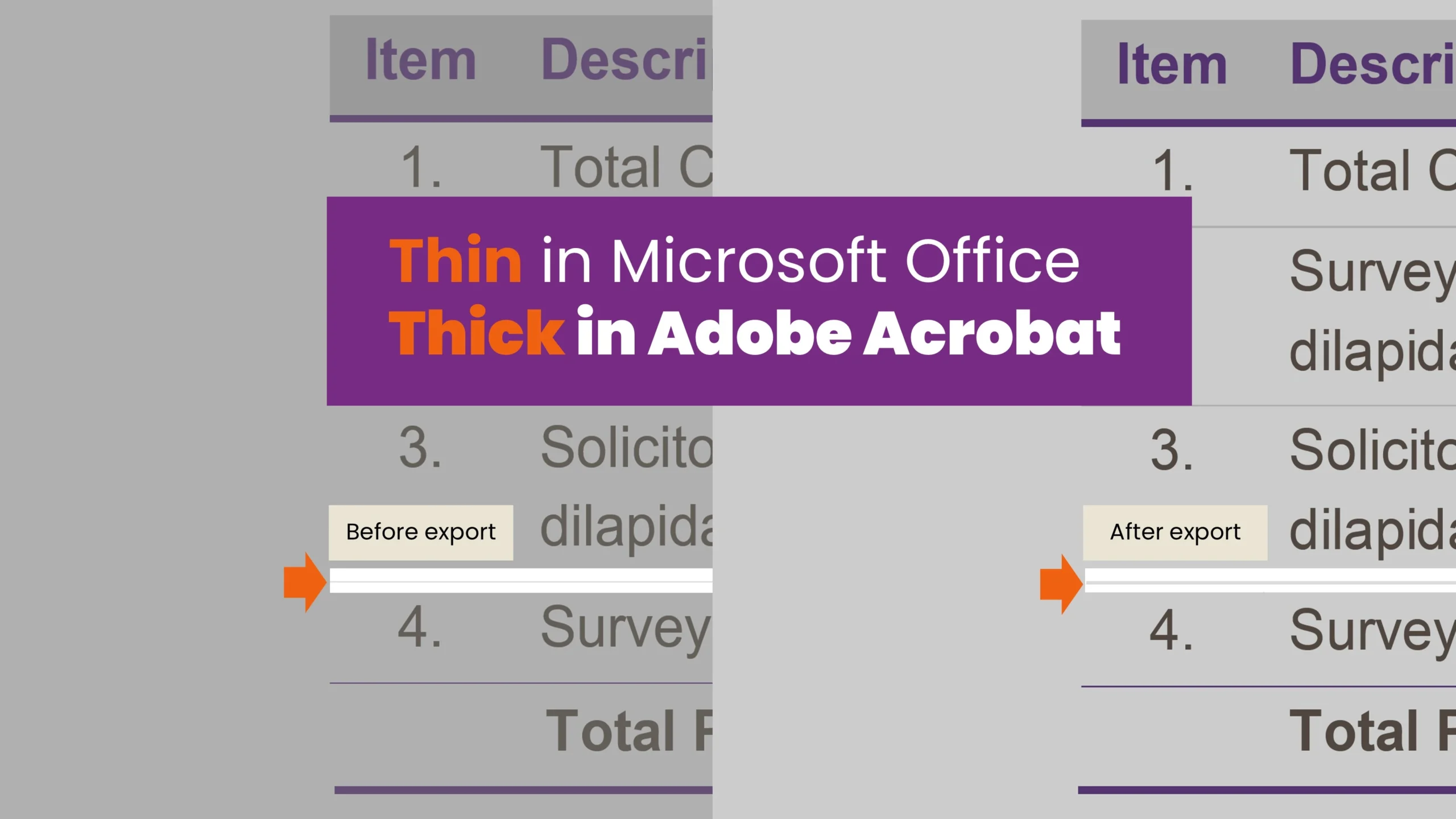
A fine border can look perfectly balanced in Microsoft Word or PowerPoint. Then you export the file to PDF and something changes.
The line looks darker. A subtle table border suddenly appears heavy. A delicate divider becomes visually dominant. At some zoom levels, it looks thicker than intended; at others, it may almost disappear.
This is a familiar issue in professionally designed Word documents and PowerPoint presentations. However, it does not always mean that the PDF export has physically changed the line weight.
In many cases, the difference is caused by how thin lines are interpreted and displayed by Word, PowerPoint, the PDF format, the PDF viewer, the screen and, eventually, the printer.
A line that appears thicker in a PDF is not necessarily physically thicker. It may simply be rendered differently by the software displaying it.
What is a hairline?
In design and print production, a hairline is an extremely thin rule or stroke. The term is often used loosely to describe any very fine border, but it can also refer to a line with no fixed physical width.
A zero-width line in a PDF is displayed as the thinnest line that the output device can reproduce. Its visible thickness may therefore vary between screens, printers and PDF viewers.
This is why a delicate line may behave differently when viewed:
- inside Word or PowerPoint;
- after conversion to PDF;
- in Adobe Acrobat;
- in a browser-based PDF viewer;
- on a high-resolution display;
- or on a printed page.
For professional document and presentation templates, it is safer to use a defined stroke weight rather than relying on the thinnest available setting.
Screen rendering is not the same as printed output
Word and PowerPoint render lines for editing. Their priority is to keep text, tables, shapes and graphics clear while you work.
A PDF viewer has a different task. It must translate the dimensions stored in the PDF into the pixel grid of the screen.
When a line is narrower than one screen pixel at the current zoom level, the viewer cannot always display it proportionally. It may therefore:
- strengthen the line to keep it visible;
- soften it across several pixels;
- make it appear darker;
- or display it inconsistently at different magnifications.
Adobe Acrobat also includes display settings that can enhance thin lines on screen. These settings may make delicate borders appear heavier even though the underlying line weight has not changed.
This is why a PDF should not be judged from one screen view alone.
Why zoom level affects line thickness
PDF content is often vector-based. A vector line is defined mathematically, allowing it to remain sharp when enlarged.
A screen, however, still displays that line using pixels.
At one zoom level, a thin line may sit neatly across a row of pixels. At another, it may fall between pixel boundaries. The PDF viewer must then approximate its appearance using anti-aliasing.
As a result, the same line can appear:
- darker at 100%;
- lighter at 125%;
- uneven in “Fit Page” view;
- or thicker than a neighbouring line with the same weight.
This is usually a display artefact, not evidence that the PDF has altered the border.
Do not redesign a border solely because it looks heavy in “Fit Page” view. Check it at several zoom levels and, where relevant, produce a physical test print.
Table borders can be particularly unpredictable
Table borders are one of the most common causes of inconsistent line weights in Word and PowerPoint PDFs.
A table may contain a mixture of:
- outside borders;
- inside horizontal and vertical borders;
- borders applied through a table style;
- manually formatted cell borders;
- and separate lines placed over the table.
Two borders occupying the same position can produce a darker or heavier-looking result. This often happens when individual cells have been reformatted after a table style was applied.
The issue may not be obvious in the editable file because Word or PowerPoint simplifies the table’s appearance on screen. During PDF creation, duplicated or inconsistent border formatting may become more visible.
For more reliable results:
- apply borders consistently;
- avoid drawing separate lines over table borders;
- check for individually formatted cells;
- and use one deliberate stroke weight wherever possible.
A well-constructed table should rely on the table’s own border system rather than additional shapes or manual fixes.
Shape outlines and vector artwork
PowerPoint shapes, Word drawing objects, charts, icons and Scalable Vector Graphics can remain as vector elements when exported to PDF.
This is usually desirable because vector artwork stays sharp and can be resized without losing quality.
However, imported vector graphics may contain strokes that are far thinner than those normally created through the Office interface. They may also include:
- overlapping outlines;
- transparent strokes;
- clipping masks;
- compound paths;
- or near-zero-width lines.
A logo or diagram may look correct in PowerPoint but behave differently after PDF export.
Where possible, vector artwork should be inspected and simplified before being placed into a template. An imported graphic should not automatically be assumed to be suitable simply because it is a vector file.
Transparency and anti-aliasing
Transparency can also affect the appearance of fine lines.
A semi-transparent shape must be blended with the content behind it. Depending on the PDF creation method and viewer, the transparent object may remain live or be divided into smaller vector and raster regions.
This can cause very fine strokes to appear slightly darker, softer or less consistent.
Anti-aliasing is then used to smooth the edges of shapes and lines. Although this usually improves the appearance of graphics, it can also make extremely thin lines look blurred or heavier than expected.
In some PDFs, faint white or dark lines may also appear where transparent or flattened objects meet. These are sometimes known as stitching lines. They may be visible only at certain zoom levels and may not appear when printed.
How thin should a line be?
There is no single minimum line weight that works for every screen, printer and production process.
For everyday corporate Word and PowerPoint templates, 0.5 point is often a safer starting point for important table borders, dividers and diagram lines.
Lighter weights can still be used for secondary detail, but they should be tested carefully.
A 0.25-point line may look elegant on a high-resolution monitor, but it can become unreliable when:
- printed on an office printer;
- reduced to a smaller page size;
- viewed in a browser;
- converted through another PDF engine;
- or displayed on a lower-resolution screen.
The correct line weight depends on its function. A structural border must remain visible, while a decorative line can often be lighter.
Design decisions should therefore be based on real-world output rather than appearance on the designer’s monitor alone.
When should artwork be rasterised?
Rasterising converts vector artwork into pixels. This can help when complex paths, transparency or overlapping objects repeatedly export incorrectly.
Rasterisation may be appropriate when:
- a detailed illustration does not export consistently;
- transparency produces visible seams;
- imported artwork contains unreliable hairlines;
- or exact visual appearance is more important than editability.
However, rasterisation should not be the default solution.
It can make text and fine details less sharp, increase file size and reduce quality when an image is enlarged.
Vectors should generally be retained for:
- logos;
- icons;
- charts;
- simple diagrams;
- and artwork that must remain sharp at different sizes.
Where necessary, rasterise only the problematic graphic rather than converting an entire page or slide into an image.
Use the correct PDF export method
The method used to create a PDF can also affect the result.
For professionally designed documents and presentations, use the built-in Save As PDF or Export to PDF function in Word or PowerPoint wherever possible.
Select the standard or print-quality option when the PDF is intended for client use, presentation, review or printing.
Avoid relying solely on:
- Print to PDF;
- browser-based conversion tools;
- third-party PDF printers;
- or automated platforms with unknown export settings.
Different conversion engines may interpret fonts, transparency, vectors and line weights differently.
It is also worth testing more than one export method when a particular file is producing inconsistent results.
Always inspect the PDF in Adobe Acrobat
Browser previews are convenient, but they should not be the only quality-control environment for a client-facing PDF.
Open the exported file in Adobe Acrobat or Acrobat Reader and review:
- the page at 100% zoom;
- the page at several additional magnifications;
- table borders and fine rules;
- transparent and overlapping objects;
- vector graphics and charts;
- and, where relevant, a physical print.
Compare the PDF with Acrobat’s thin-line display settings enabled and disabled. This can help determine whether the apparent thickness is part of the file or simply a viewer preference.
It is also useful to check the PDF on more than one screen, particularly when the document will be circulated widely.
Reliable PDF output begins in the template
PDF line-weight problems are often treated as export problems, but many begin in the construction of the Word document or PowerPoint template.
Inconsistent table borders, extremely fine shape outlines, duplicated objects, unsuitable vector artwork and unnecessary transparency can remain hidden until the file is exported.
A professionally developed template should therefore be tested not only as an editable Office file, but also as a completed document across its likely delivery formats.
The aim is not simply to make a template look correct in Word or PowerPoint. It must remain visually consistent when edited, exported, shared, viewed and printed.
At ZOARC Creative, we design and build robust Microsoft Word and PowerPoint templates with real-world document production in mind. This includes the details that are easy to overlook: border behaviour, table construction, vector artwork, PDF conversion and reliable output across different viewing environments.
Speak to us about developing or reviewing your organisation’s Word and PowerPoint templates for dependable, on-brand PDF output.
Explore more...
- ±5 minutes read

- ±10 minutes read

- ±7 minutes read

- ±12 minutes read

- ±8 minutes read

- ±9 minutes read