Project overview
Client
Atmos Consulting
Industry
Environmental and planning consultancy
Service
Word
Let’s refresh technical reports.
Brief
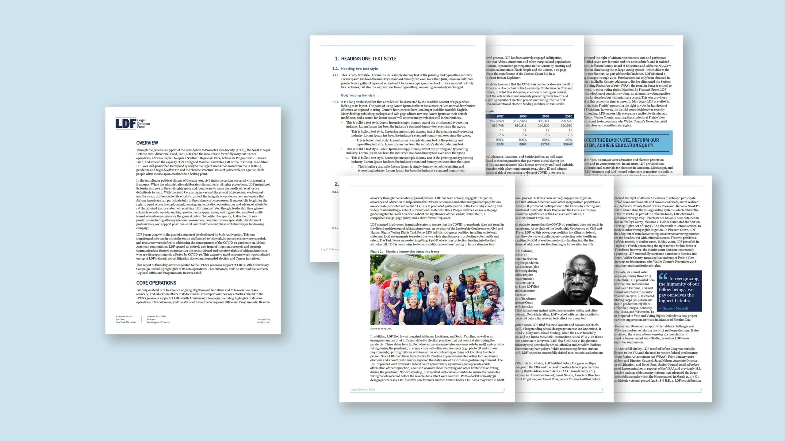
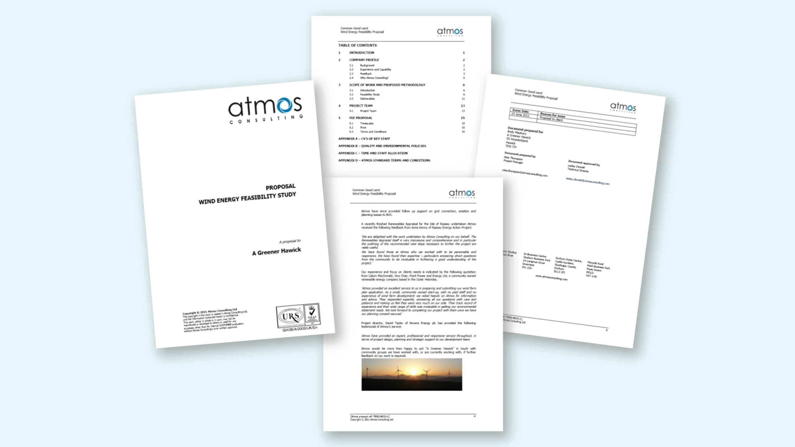
Atmos Consulting needed a Word report template that felt more confident, colourful and professional than the existing black-and-white document. At the time, the visual system was still evolving and there was limited digital brand material to draw from, so the strongest assets were the logo and its distinctive blue mark. The existing report worked functionally, but it looked generic: the logo was placed into a standard document, while the overall layout relied on basic typography and minimal visual structure. The brief was to create a brand-aligned Microsoft Word template that looked less like a default Word file and more like a designed consultancy report. The template needed to cover proposals, technical reports, contents pages, version history, body pages, tables and appendices. Above all, it had to remain practical for consultants: easy to edit, reliable for long reports, and clean when exported to PDF.
Approach
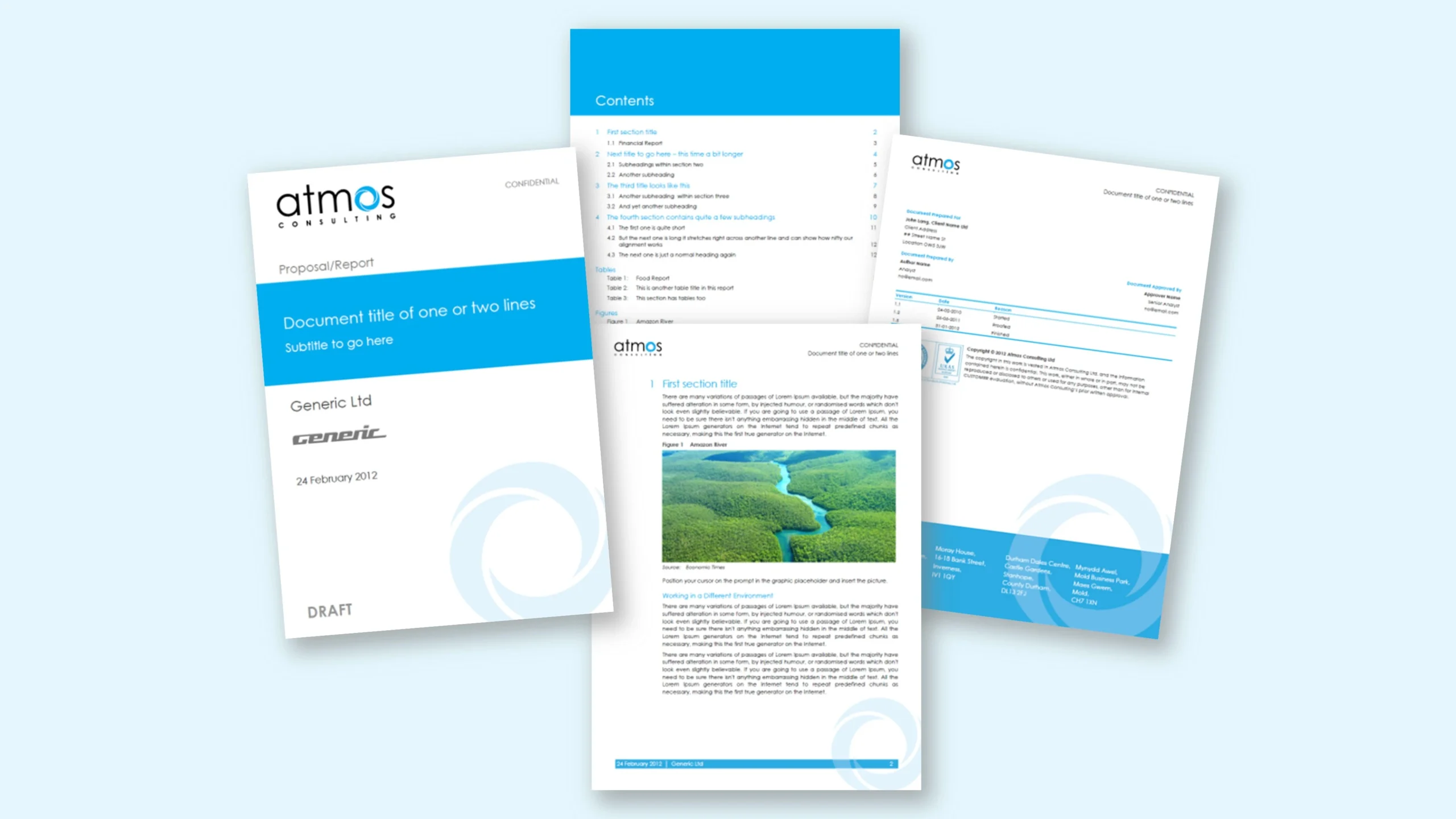
We started by extracting the most useful visual cues from the logo: the blue accent, circular shape language and clean typographic style. These became the foundation for a brighter report system. The cover was redesigned with a bold blue title band, improved hierarchy and a lighter watermark based on the logo’s circular motif. Inside pages used the same asset as a subtle background device, creating continuity without distracting from technical content. We built the file as a style-driven Word template, with defined heading levels, body styles, captions, table styles, contents formatting, headers, footers and version-history pages. The page architecture was designed to feel more editorial while still using native Word features, so consultants could update text, images and tables without designer support. Blue was used as a functional accent for section headings, table rules and navigation cues, while white space kept dense report content readable. Finally, we checked the template across typical report scenarios—contents, long text, images, tables and PDF export—to make sure the refreshed design stayed stable during everyday editing.
Outcome
The refreshed template gave Atmos Consulting a far more distinctive report style while keeping the document easy to use. The report no longer looked like a generic Word file; instead, it carried a clear brand presence through colour, watermark assets, structured pages and consistent typography. Consultants could still work in familiar Microsoft Word, but with stronger visual hierarchy and a cleaner PDF output. The before-and-after transformation also demonstrated how much value can be created from limited brand material: by using the logo intelligently, the template gained personality, consistency and a more professional feel without becoming difficult to maintain.