Project overview
Client
Legal Defense Fund
Industry
Legal non-profit
Service
Word
Let’s simplify legal letters.
Brief
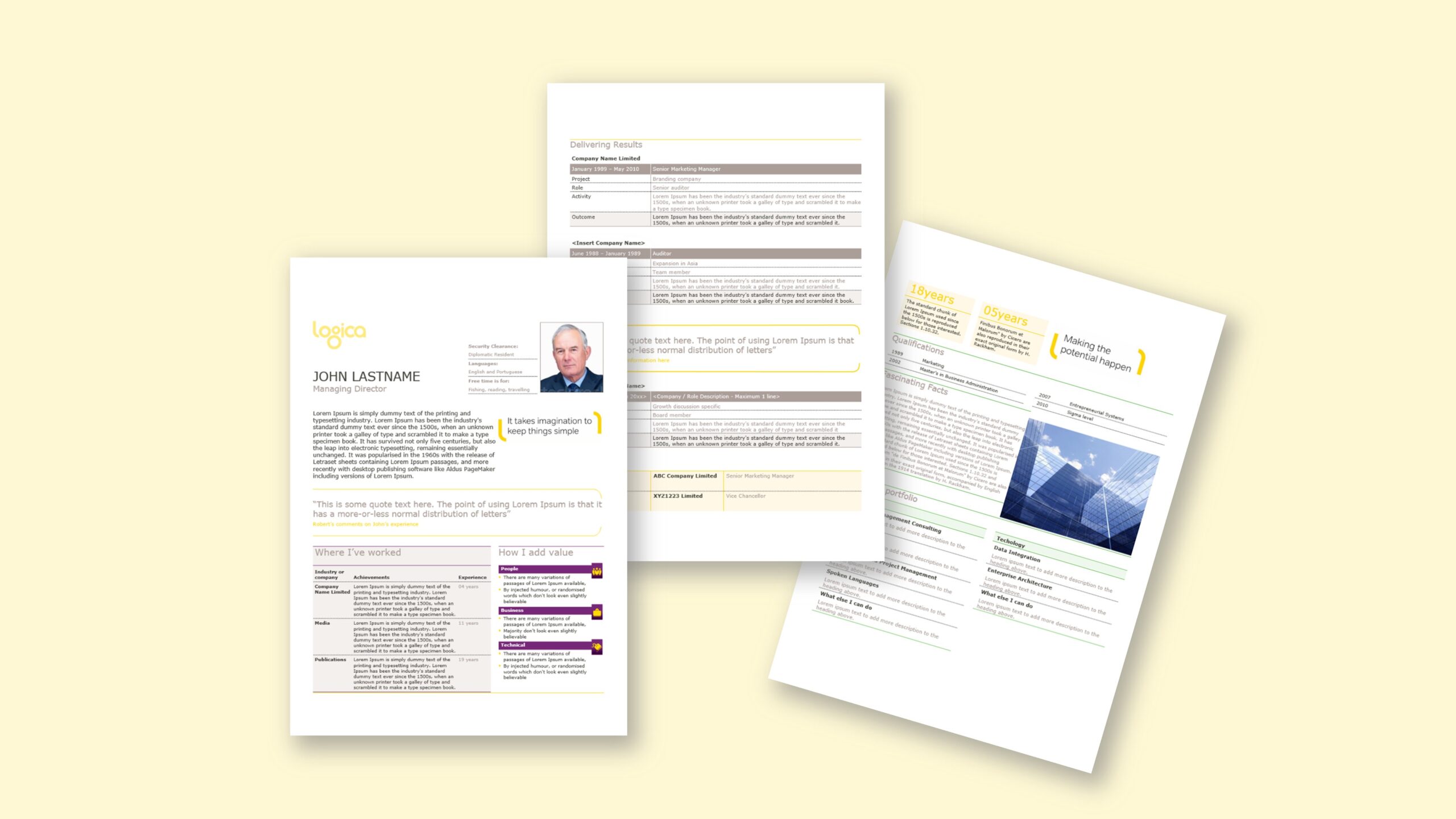
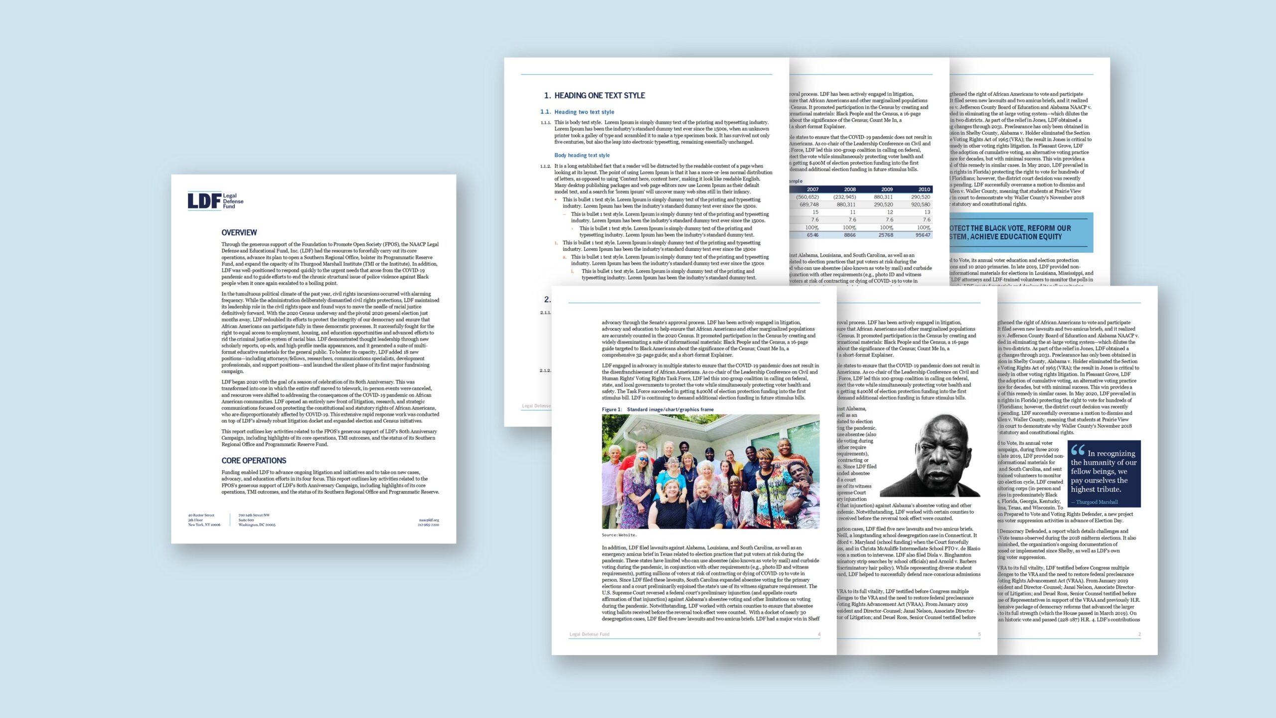
LDF wanted a Word letterhead template that stayed simple yet handled longer communications. Instead of a traditional “report with cover/back”, their authors prefer to start on page one and extend as needed. Therefore, the template needed to support tables, pull-out message boxes, code/quote boxes, graphic frames for images and occasional landscape pages, while keeping edits easy for non-designers. We kept the build manual—no bespoke macros—so the file remains portable and predictable across systems. Brand colours, typography and spacing were defined in styles, and a small Quick Parts library provided pre-formatted elements that drop in without breaking the layout. The goal was clarity over ornament: a letter that can expand gracefully into a multi-page communication, reads well on screen and in print, and preserves a brand-true voice through disciplined styles and the approved brand font.
Approach
We rebuilt the letterhead as a disciplined, style-driven Word template. Theme colours and fonts established hierarchy; a tidy grid set margins, columns and safe areas; and headings, lists, captions and table styles were engineered to hold spacing during edits. To support richer content, we supplied Quick Parts for pull-out messages, key-point panels, quotes/code boxes and image frames with caption styles. A landscape section preset adds wide content without manual reformatting, while cross-references and page numbering remain intact. Because the template is macro-free, behaviour is predictable on standard Word installs. Edit-view tips explain when to use pull-outs, how to place images inside graphic frames, and how to switch a page to landscape via the built-in preset. We validated screen and PDF export so colour, contrast and line rendering remain clean. The result is a simple letter that scales: authors click and type, insert pre-formatted elements as needed, and keep brand fidelity with minimal effort.
Outcome
Editors now produce letters faster and with fewer formatting fixes. The style system prevents drift; Quick Parts provide emphasis without manual styling; and the landscape preset supports occasional wide content. Because the template is macro-free, it behaves consistently across machines, while the brand font and colour scheme deliver a clear, professional voice. Exports to PDF are crisp and predictable, and teams can extend a one-page letter into a longer communication without inserting a separate report template. Overall, the organisation gains speed, consistency and a low-friction way to publish everyday letters in Microsoft Word.
When we rolled out a new brand, we were faced with the challenge of creating Microsoft templates that not only adhere to brand standards but are user-friendly and support the impactful work of the organisation. To say I was relieved to find and work with ZOARC studio would be a vast understatement. They have an intimate knowledge of Microsoft, coupled with practical experience from other clients across industry sectors, which means they know how users are likely to use the templates as well as how to navigate Microsoft’s limitations.