Project overview
Client
Pen Underwriting
Industry
Insurance / MGA
Service
PowerPoint
Let’s make your brand alive.
Brief
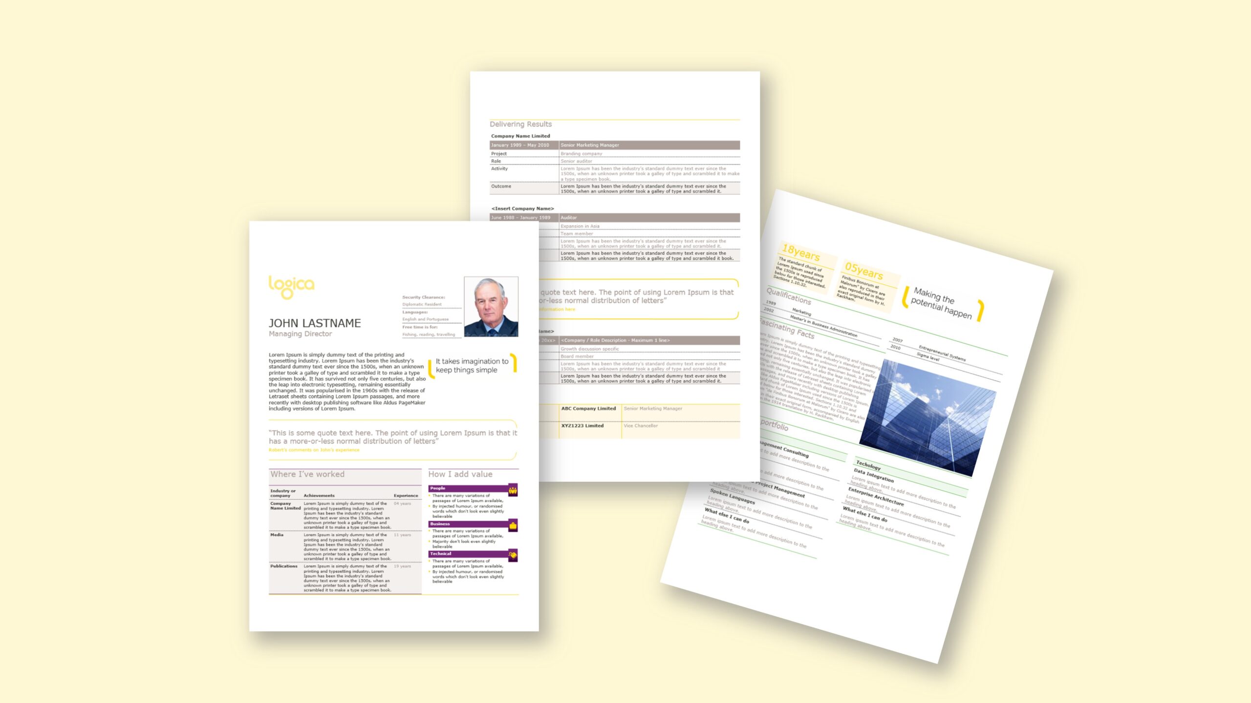
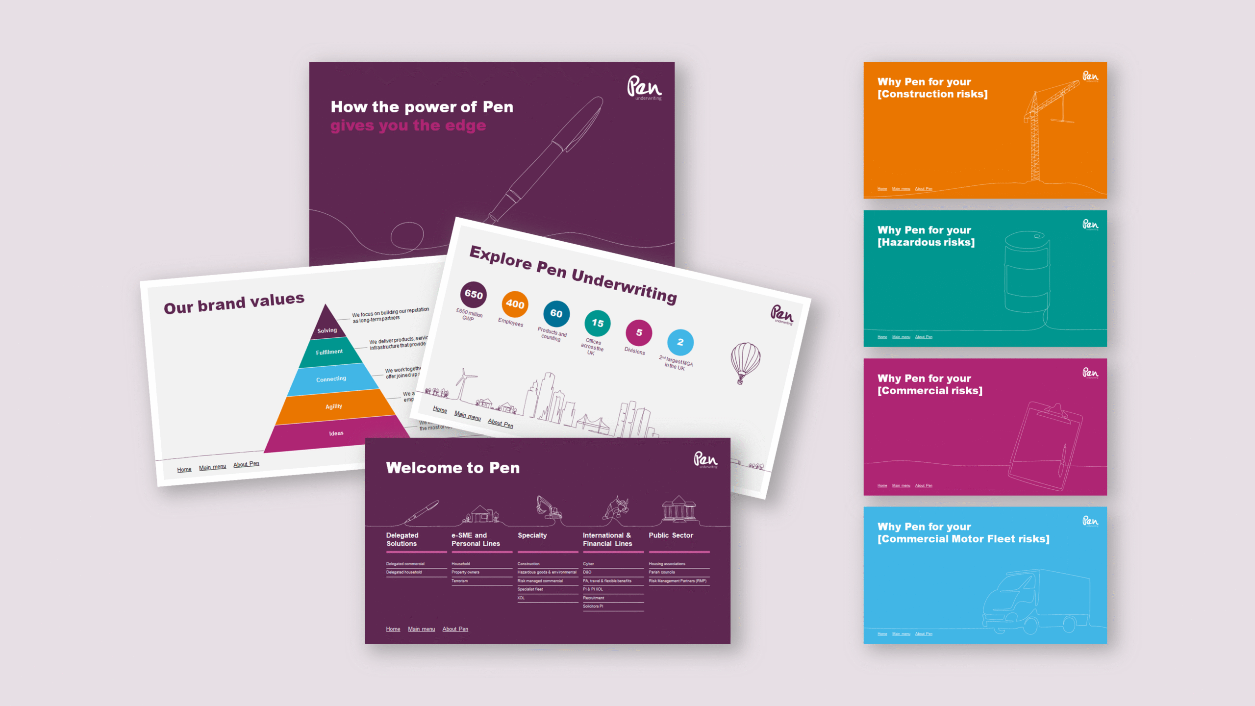
Working with a London brand agency, we were asked to produce PowerPoint templates for a leading insurance brand. The creative featured a distinctive set of hand-drawn doodles that gave the slides a clean, human feel. Our task was to convert the concept into editable PowerPoint template design for insurance—faithful to the original look, yet robust enough for everyday authoring. The challenge lay in maintaining stroke thickness across multiple illustration sizes and ensuring the artwork stayed crisp when placed, scaled or exported. In parallel, the client used an older version of PowerPoint, so hyperlink behaviour and a few interactions differed from modern builds. We needed to make the new templates work elegantly in that legacy environment and provide simple guidance for users. The deliverable included a base template and a small set of pre-formatted slides that marketing and teams could adapt quickly for pitches and internal presentations, without compromising the hand-drawn aesthetic.
Approach
We began by dissecting the designer’s system—type, spacing, grid and the line quality of each doodle. To preserve the hand-drawn look, we converted illustrations to vector artwork where available, set consistent stroke weights, and established scaling rules so line thickness remained visually even across sizes. We rebuilt the concept natively in PowerPoint: theme colours, font themes, and a disciplined slide master with custom layouts that encode margins, columns and safe areas. Ready slides covered common needs—title, section openers, agenda, quote panels, image-led stories and data highlights—each tuned to the typographic rhythm and illustration style. Because the client worked on an older PowerPoint version, we audited hyperlink behaviour, navigation and export settings, then provided backward-compatible choices (for example, avoiding link types known to differ) and concise usage notes so users understood what would change after an upgrade. Finally, we validated on typical enterprise machines, checking on-screen rendering, PDF export and projector output, ensuring the doodle lines stayed clean, crisp and consistent from slide build to final delivery.
Outcome
Teams can now build decks faster while keeping the crafted, hand-drawn aesthetic intact. The slide master controls spacing and type, so brand drift is reduced, and the pre-formatted slides accelerate common layouts. Crucially, line strokes remain consistent as illustrations are resized, and hyperlinks behave as expected in the client’s legacy PowerPoint version. As a result, editors focus on content and imagery rather than troubleshooting formatting, and the brand retains its human, distinctive feel across strategy presentations, sales decks and internal communications.