Project overview
Client
DUAL
Industry
Insurance / MGA
Service
PowerPoint
Let’s streamline insurance decks.
Brief
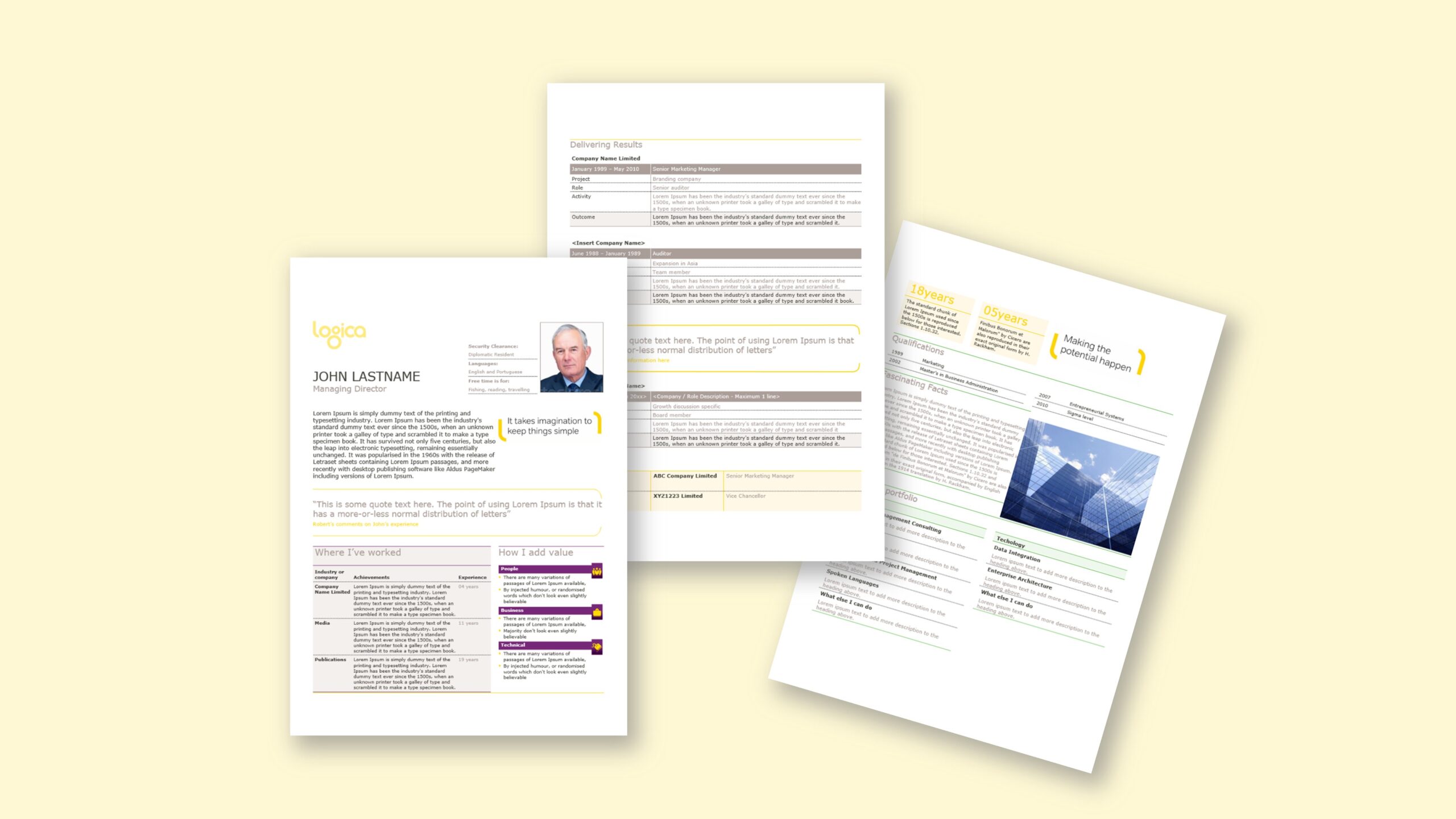
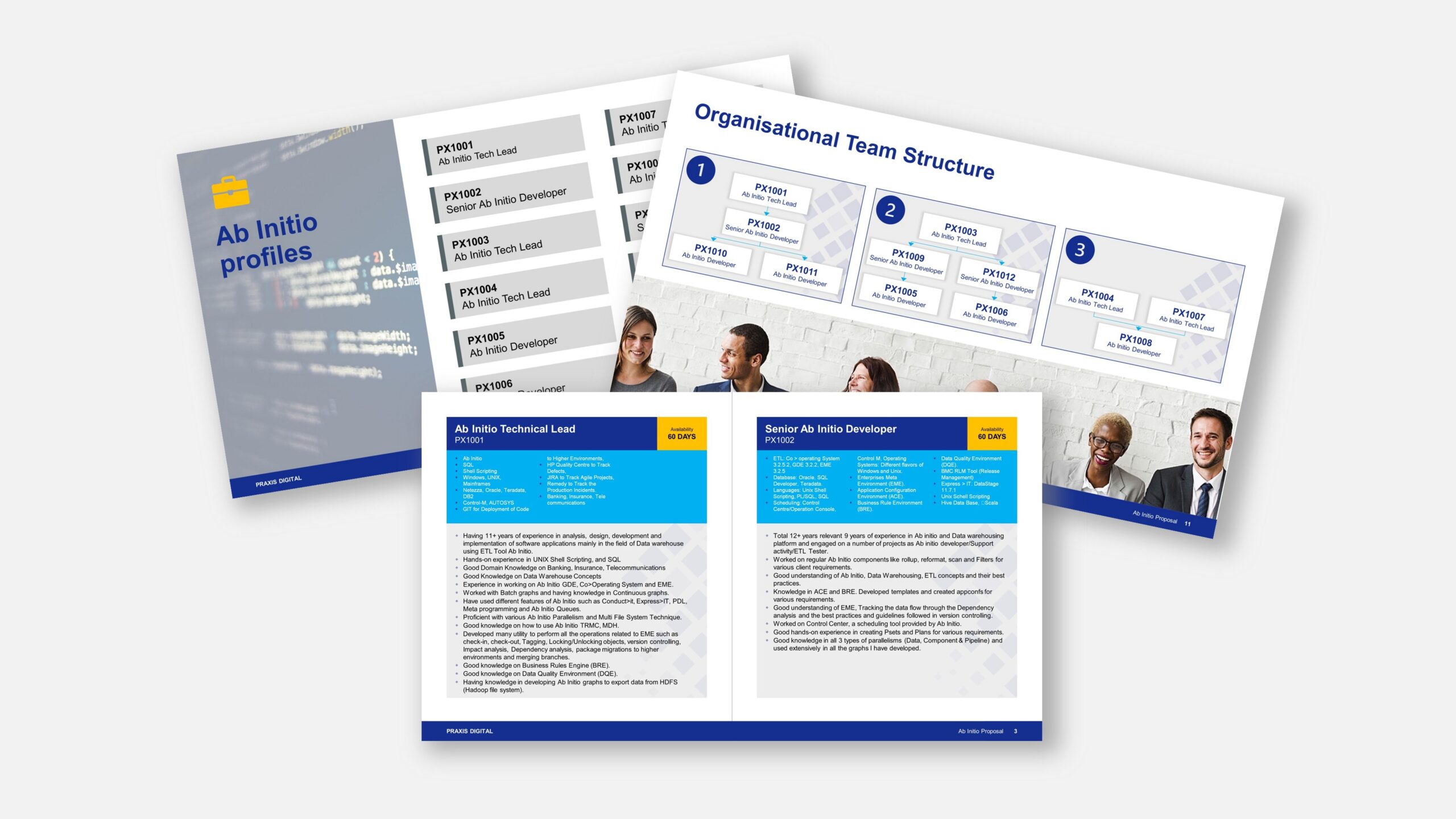
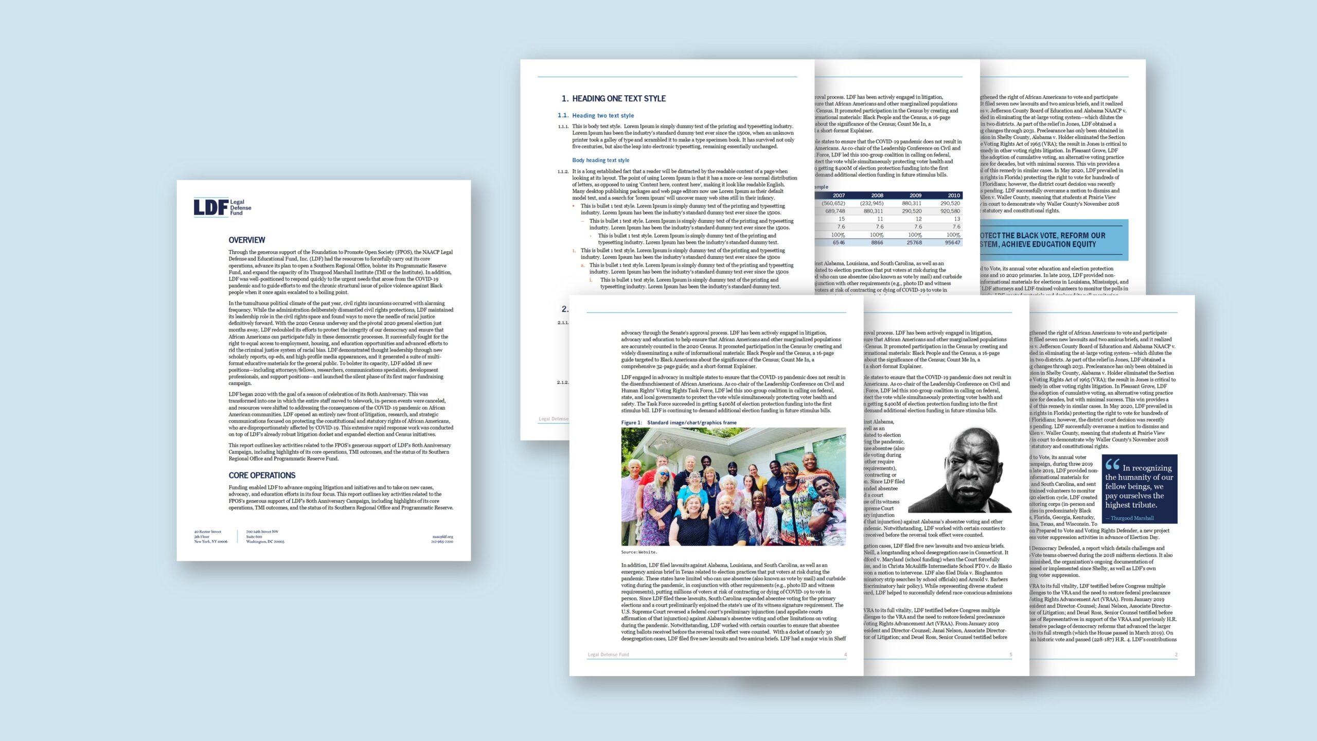
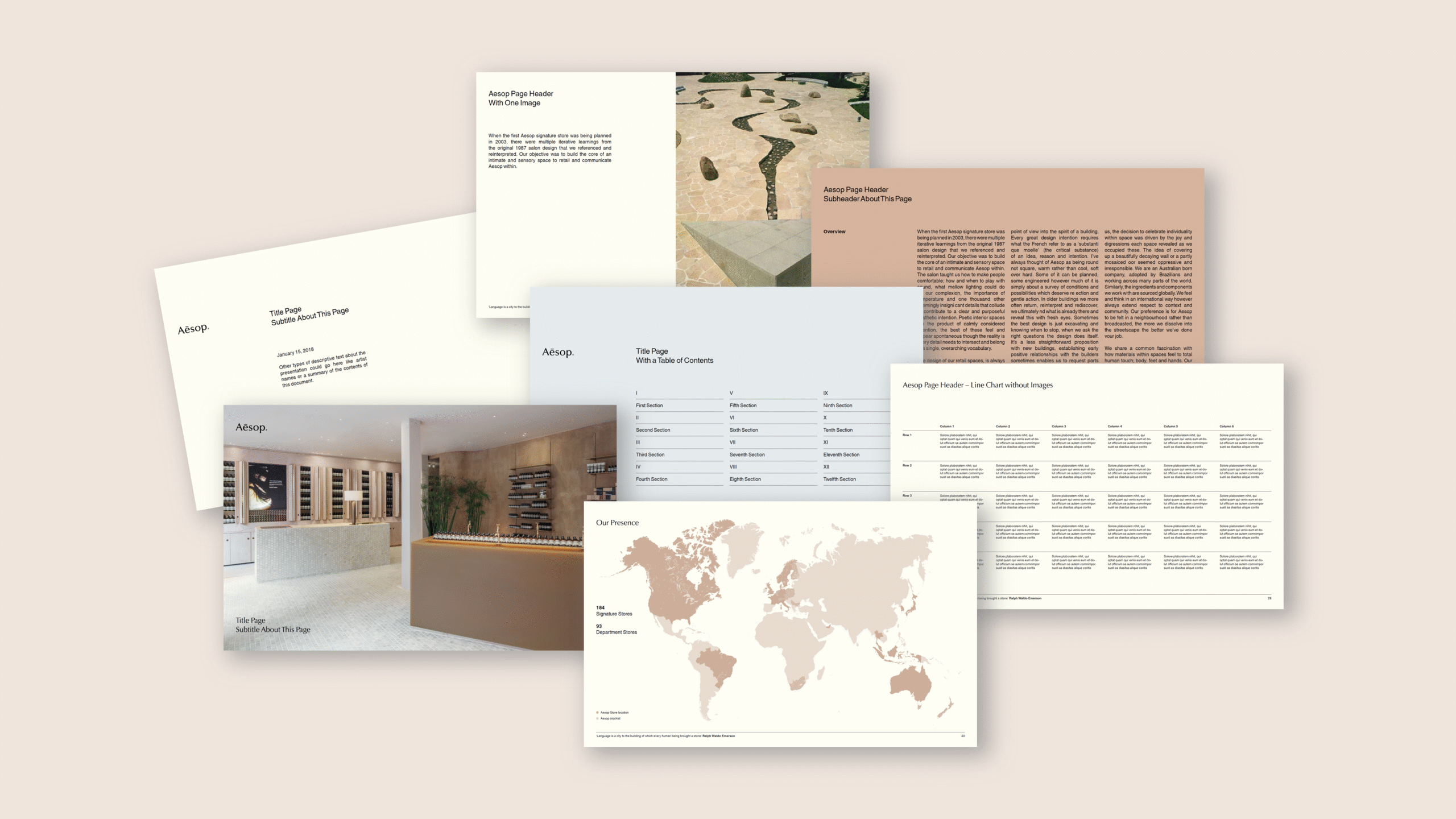
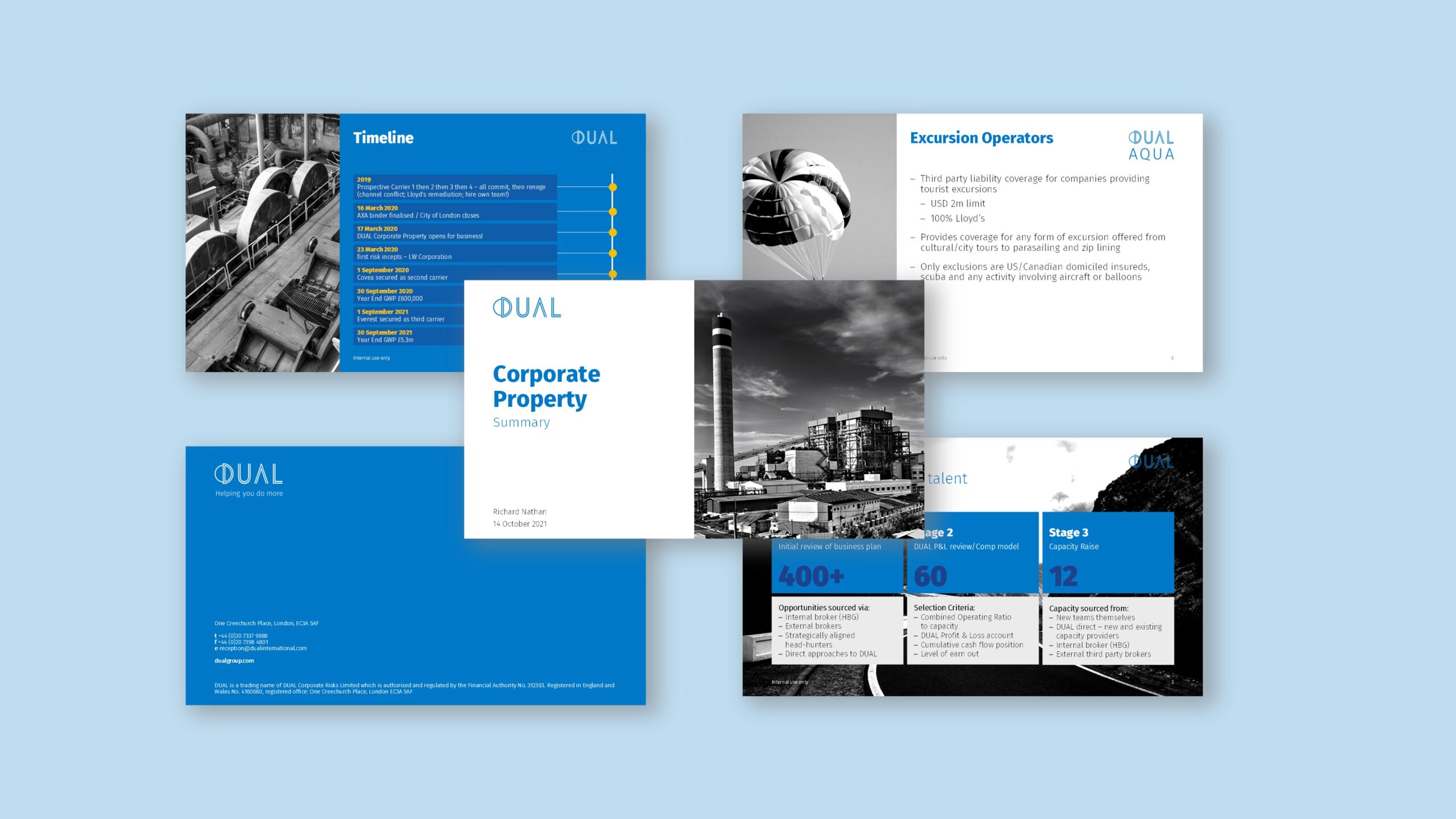
DUAL asked for a presentation system that is easy for everyday users, brand-true, and resilient under time pressure. At the time, guidelines specified Calibri as the corporate typeface, a palette built around deep blues with selective accent colours, and grayscale imagery with strong contrast to focus attention. After reviewing how teams actually built decks, we found many users chose a layout and then added ad-hoc text boxes and shapes—leading to drift and rework. The goal, therefore, was to deliver a streamlined PowerPoint template with a small, purposeful set of layouts that covers the majority of use cases, supported by a curated slide library for recurring stories. Alongside that, we supplied template enhancement tools—an extended, brand-calibrated brand colour tint palette, custom table styles, and consistent text styles—so users can work quickly without breaking the design, while grayscale imagery reads crisply against the brand’s blue system.
Approach
We rebuilt the identity natively in PowerPoint and encoded it into a disciplined slide master: theme colours tuned to brand blues and accent tints, Calibri pairings, and a grid that fixes margins, columns and safe areas. Instead of “hundreds” of options, we delivered a tight set of custom layouts—title, section openers, content-with-notes, comparison, image-led spreads, data highlights and quote panels—engineered so text, charts and images snap into place without manual nudging. To support dense, grayscale photography, we set image placeholders with predictable cropping and applied contrast-friendly caption styles. We added a brand tint palette (beyond Microsoft’s auto tints) so emphasis colours always feel on-brand, and we packaged custom table styles to keep formatting consistent. A companion slide library provided ready examples—agenda, pipeline, team, timeline —so authors start from proven patterns rather than rebuilding from scratch. Finally, concise edit-view tips explain when to use each layout, how to keep colour balance, and why to avoid free-floating text boxes that break alignment.
Outcome
Teams now produce clearer decks faster, with fewer fixes. The minimal layout set reduces decision fatigue while keeping slides consistent; the slide library accelerates common stories; and the brand tint palette plus custom table styles make content look deliberate rather than improvised. Grayscale images read crisply against the blue system, and typography holds together because spacing and hierarchy are encoded in the master. In practice, users focus on the message—not formatting—while the brand presents a confident, unified voice in Microsoft PowerPoint.
We can’t recommend the studio highly enough. They have an incredibly detailed grasp of Microsoft Word and PowerPoint and have delivered great projects for us every time. The studio is a true consultant in that they worked with us to develop the project scope and deliverables, advising on best practice in a pragmatic and helpful way. This includes helping us avoid potential issues and explaining things very clearly. They are very easy to deal with and very responsive. If you need someone to work on your Word and PowerPoint templates, look no further!