Project overview
Client
Amtico
Industry
Flooring
Service
PowerPoint
Let’s elevate your deck visuals.
Brief
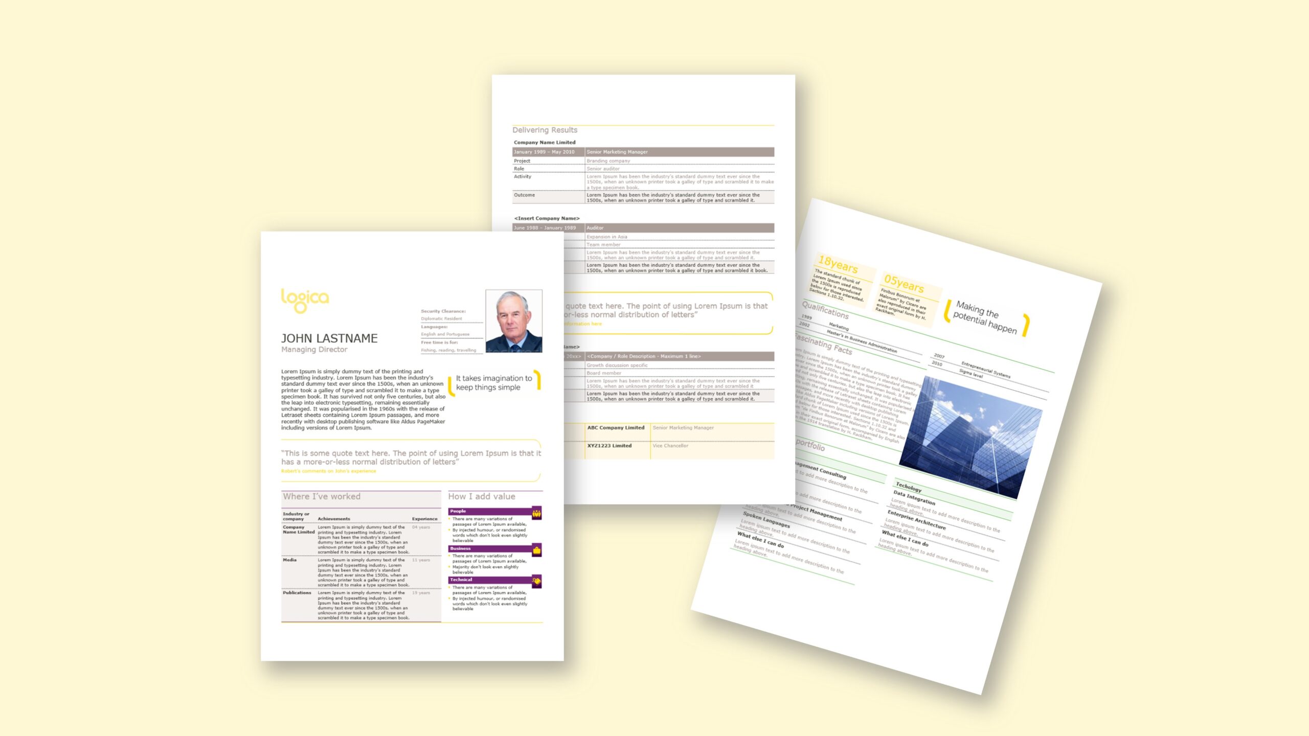
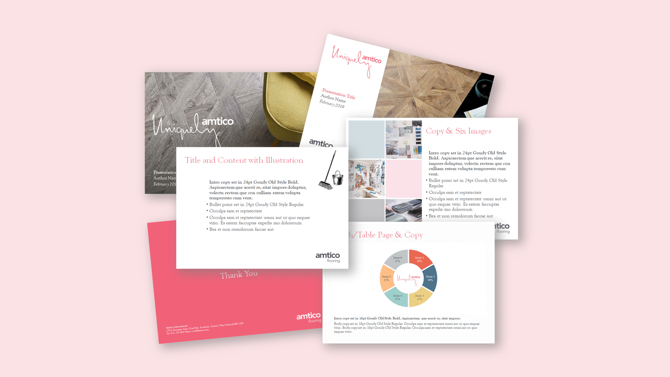
Amtico—part of the Mannington family and a leading LVT flooring brand—asked us to convert an in-house design into a sturdy, everyday PowerPoint template. The creative was intentionally simple so content could breathe; the value came from colour, illustration and confident negative space. Our task was to replicate that look faithfully in PowerPoint and keep it easy for non-designers. The deck needed multiple layouts to showcase product stories, installation examples and pattern options, plus a library of illustrative elements indicating flooring patterns that users could copy-paste where needed. Slides were to be light on text, highly graphic and fast to edit. Finally, the brand specified a custom font; we embedded it to preserve the typographic voice while keeping the base file lean. In short, the brief centred on a brand-true template that looks distinctive through colour and illustration, remains straightforward to use, and exports cleanly for sales and marketing presentations.
Approach
We rebuilt the system natively in PowerPoint: theme colours, font themes and a grid encoding margins, columns and safe areas so titles, copy and imagery align without nudging. A disciplined slide master with custom layouts covered hero openers, product panels, comparison spreads, image-led narratives and data highlights. To foreground visuals, we prepared an illustration library of flooring pattern markers and icons as vector shapes; users simply copy-paste or duplicate them, with clear naming in the Selection Pane. We tuned image placeholders to preserve aspect ratios and predictable cropping. Because typography is central to the brand, we embedded the custom font but controlled file weight by limiting unused variants, leveraging vectors over bitmaps and pruning redundant masters. We documented quick “how-tos” (edit-view only) for swapping imagery, scaling pattern illustrations and maintaining colour balance. Finally, we validated projector output and PDF export so saturated colours and fine lines render cleanly. The result feels minimal yet expressive: colour and illustration do the heavy lifting while the master keeps structure intact.
Outcome
Marketing now assembles bold, graphic decks quickly and consistently. The slide master maintains spacing and type; multi-layout options adapt to different story shapes; and copy-paste illustrations make pattern communication effortless. Thanks to embedded fonts and vector assets, the base file stays compact and exports remain crisp. The template proves a point: even a simple deck can feel distinctive when colour, typography and illustration are handled well—delivering a brand-true presentation system in Microsoft PowerPoint.