
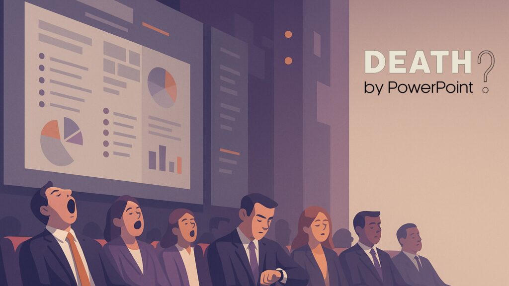
Death by PowerPoint? Fix the real problem
Posted on
13 September 2025
Reading time
±6 minutes read
Section
Presentation design
Industry
Professional services
Services
Presentations
End “death by PowerPoint”.
Is PowerPoint Really the Problem?
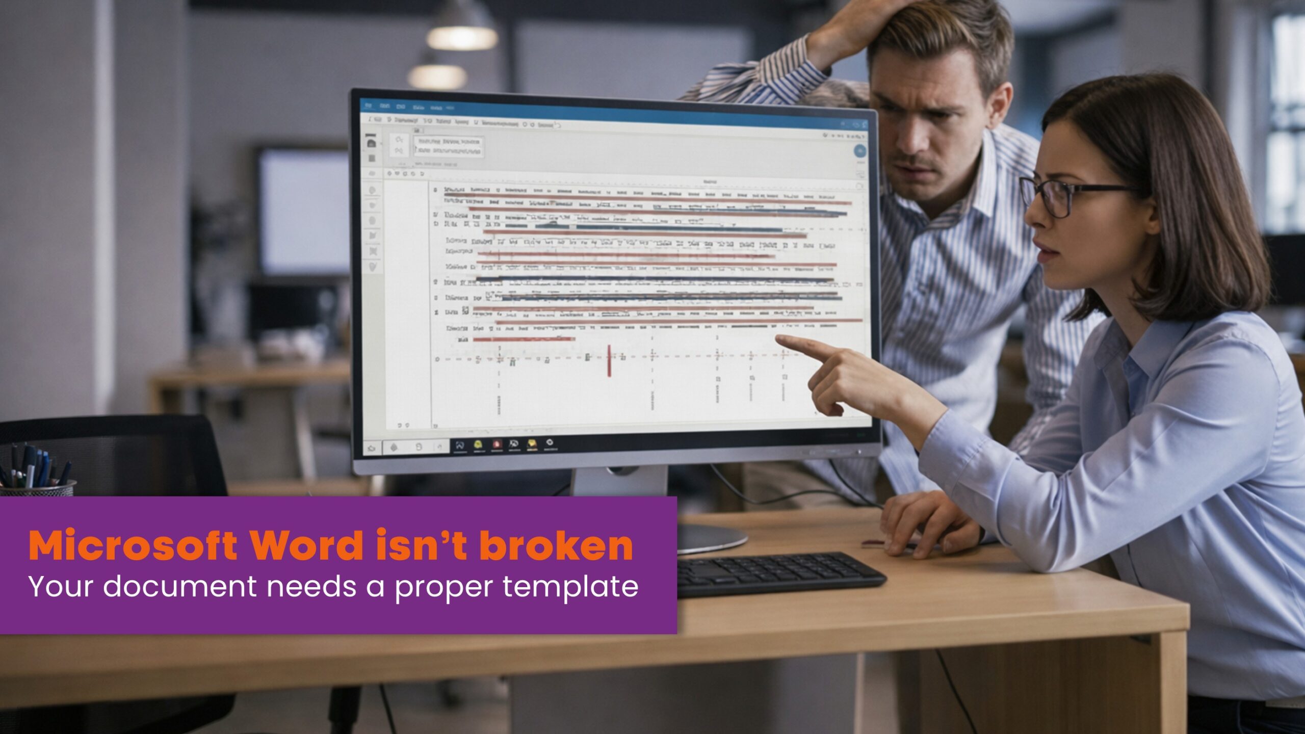
When a presentation falls flat, we hear “death by PowerPoint.” It’s become shorthand for boredom, poor design, and missed opportunities. But is the software really to blame—or is it the process behind the slides? In our work with investment banks, research firms and asset managers, we’ve found the culprit is usually rushed preparation, inconsistent formatting, and a lack of robust templates rather than PowerPoint itself. A balanced view helps: Edward Tufte famously criticised slideware’s defaults for weakening analytical communication—but even his critique is really about misuse, not inevitability.
PowerPoint is not the enemy…poor preparation is.
The last-minute pattern is familiar. Content is developed for days or weeks, but slides are briefed late or changed at the eleventh hour. Good design needs stages—time to explore, define, develop and deliver. That’s not indulgence; it’s the standard design process. Give design the right stages and the work gets sharper; compress those stages and quality suffers.
Great slides need time—last-minute changes leave little room for design.
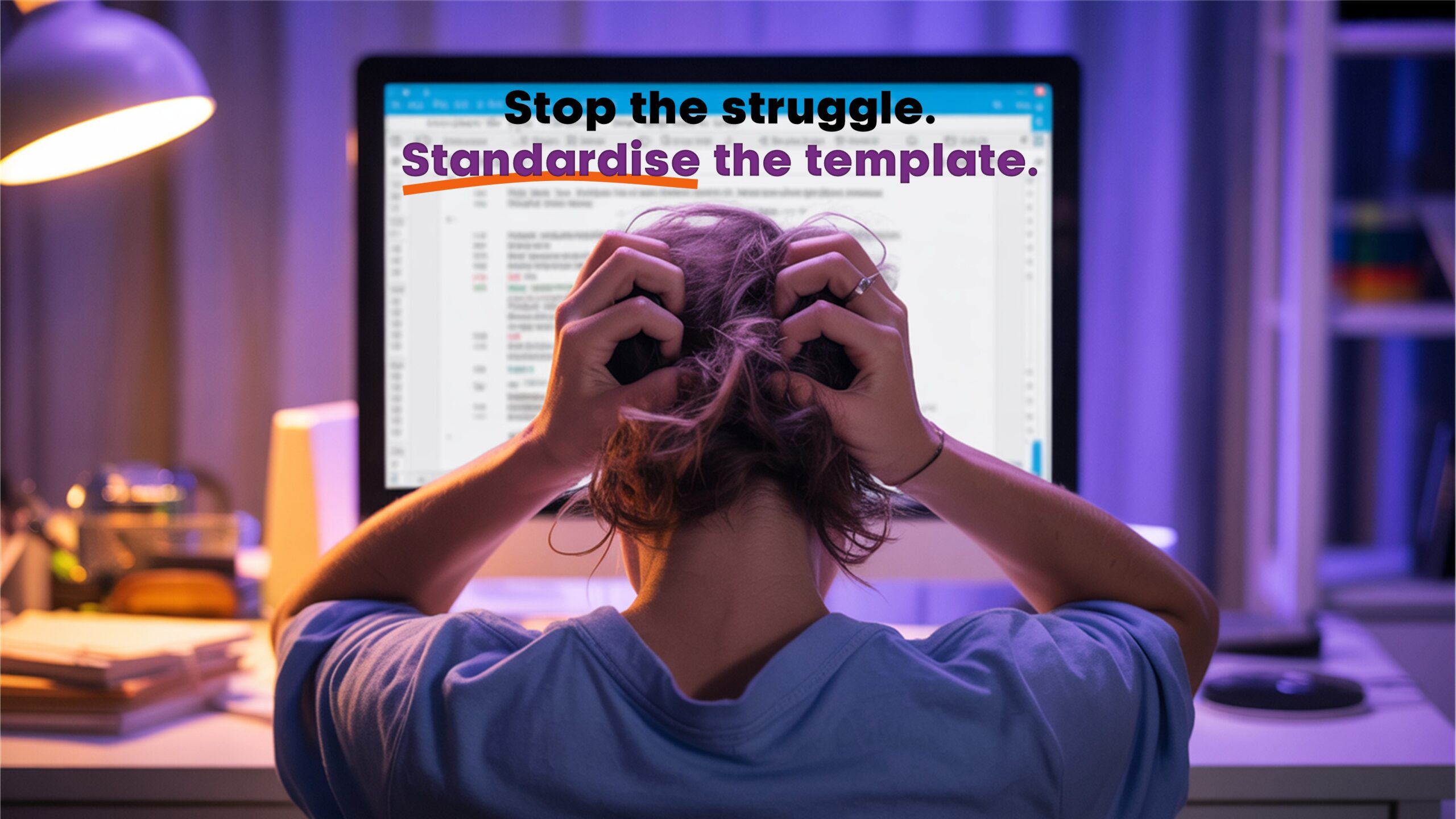
Because time is often tight, we advise building a reusable slide library: pre-designed, on-brand layouts for common scenarios (company overviews, investment theses, roadmaps, charts). This turns decks into a system, reduces rework, and prevents the notorious “Franken-deck” of mismatched fonts, colours and layouts that creeps in under pressure. Presentation authorities such as Duarte advocate systematised templates to end “Frankenslides” and keep decks consistent and fast to produce.
A slide library saves hours when deadlines are short.
When you must build under pressure, the most powerful principle is consistency. Consistent fonts, sizes, colours and alignment immediately raise perceived quality and credibility. Usability research shows that breaking conventions increases cognitive load; meeting expectations (consistency and standards) reduces strain and helps the message land.
Consistency in fonts, colours, and alignment is half the battle won.
There’s also solid learning science behind clean slides. Richard Mayer’s multimedia learning research and John Sweller’s cognitive load theory show that removing extraneous detail and avoiding redundant on-screen text while speaking helps people learn and remember more; clutter does the opposite. Swedish presentation expert David JP Phillips popularised this for business audiences with practical rules such as one message per slide, making the most important element the biggest, and using contrast to direct attention.
Less clutter, clearer thinking.
Templates make this easier in everyday work. Microsoft’s own guidance explains that themes and templates lock in colours, fonts and layouts to keep a deck visually consistent—so individuals do not have to make brand decisions on every slide. In short: a well-built template turns non-designers into confident presenters.
A good template turns non-designers into confident presenters.
For brevity and structure under pressure, Guy Kawasaki’s well-known 10/20/30 rule—ten slides, twenty minutes, minimum thirty-point text—remains a useful discipline. It is not a law, but it does force clarity and scannability when stakes are high.
Simplify the story: fewer slides, bigger type, sharper point.
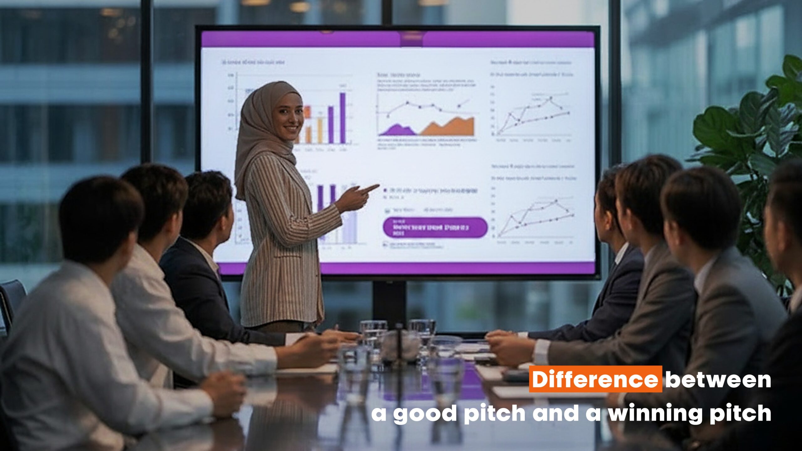
So, is PowerPoint the problem? Not if you build the right foundations: time for design stages when possible; a slide library for speed; strict consistency for credibility; templates that encode your brand; and content discipline rooted in cognitive science. That’s how organisations move beyond “death by PowerPoint” to presentations that inspire confidence, clarity and action.
Explore more...
- ±10 minutes read
- ±8 minutes read

- ±7 minutes read
- ±7 minutes read
- ±6 minutes read
- ±5 minutes read
- ±10 minutes read
- ±8 minutes read
- ±7 minutes read