Bespoke fonts in Microsoft Word and PowerPoint: Brand consistency without surprises
Posted on
10 March 2026
Reading time
±10 minutes read
Section
Templates
Industry
Corporate Communications
Services
Template Development
Let’s build a font-safe template.

Typography matters. A good typeface sets tone, improves readability, and helps a document feel unmistakably on brand. This is why many graphic designers push hard for bespoke fonts in brand guidelines, and why it can feel uncomfortable to compromise.
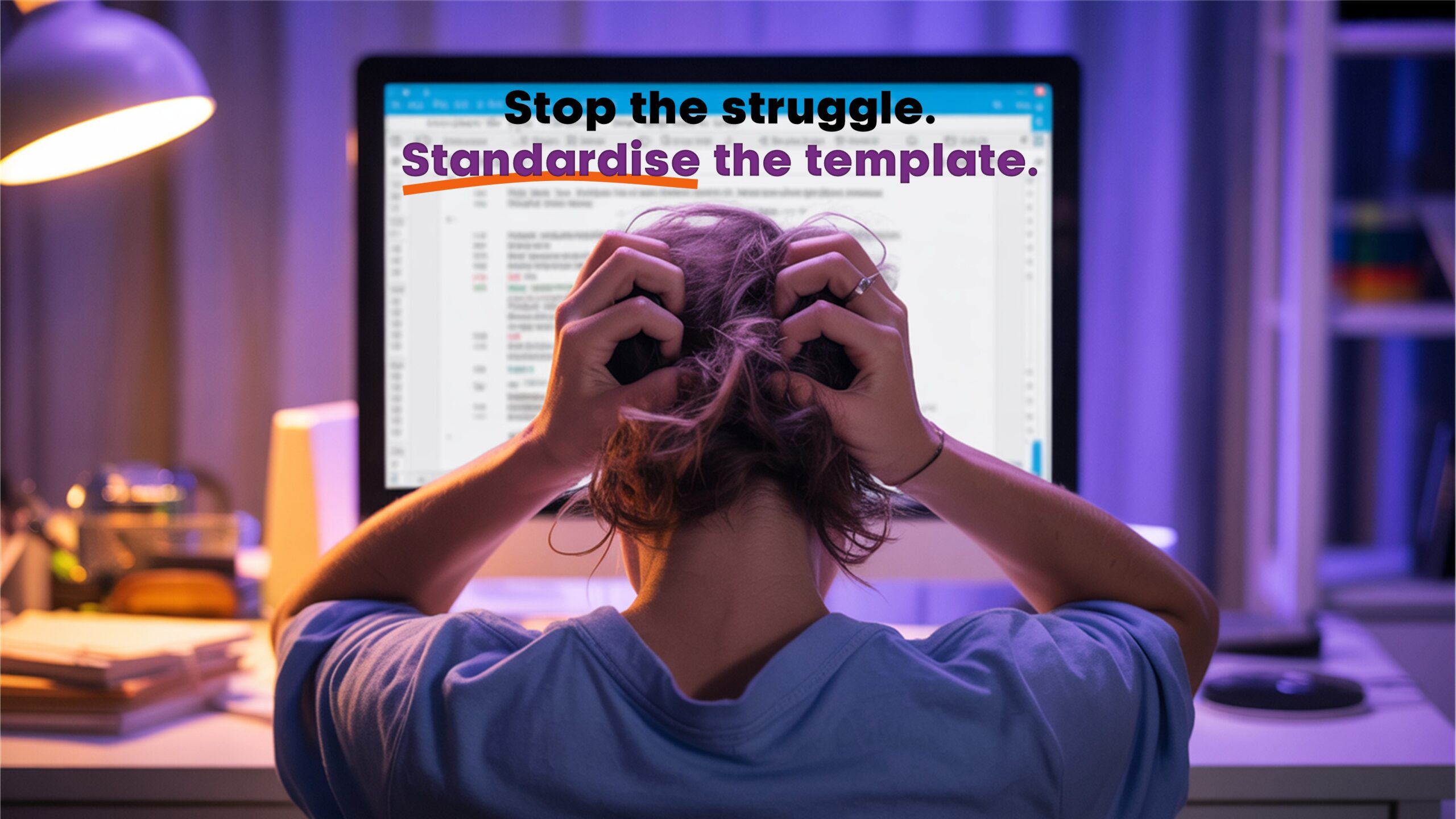
The challenge is that Microsoft Word and PowerPoint are not design software. They are collaboration tools. Files move across devices, versions, operating systems, and meeting rooms. A font choice that looks perfect on the template designers machine can quietly unravel when someone else opens the same file. That is when spacing changes, line breaks shift, bullets misalign, and carefully balanced slides start to look inconsistent.
Microsoft Most Valuable Professionals regularly highlight the same underlying reality: if you treat fonts as a design flourish instead of a deployment decision, you will keep fighting layout issues later.
Why bespoke fonts cause trouble in real Office workflows
When a font is missing, Office has to improvise. Word and PowerPoint will substitute with a different font that is available on the recipients machine. You often have limited visibility and limited control over which substitute is chosen, and the result can be different across machines. Even more confusing, PowerPoint can also substitute a different font when a character is not present in the chosen font, such as certain symbols or bullet characters.
This matters because typography is not just how letters look, it is how text occupies space:
Kerning and spacing change: A substitute font can have different character widths and kerning pairs.
Line breaks and wrapping change: The same sentence can reflow and create a new line, pushing content down.
Text boxes overflow: In PowerPoint, a small reflow can trigger shrink-to-fit, clipping, or unexpected line breaks.
Tables and alignment drift: In Word, tables, headings, and page breaks can shift in ways that are hard to spot until printing or exporting.
If the design depends on text fitting a precise area, such as slide titles that must stay on one line or a Word cover page with strict spacing, font reliability becomes critical.
Brand fonts look brilliant in a guideline, but in Word and PowerPoint they are also a deployment decision.
The three practical options (and the trade-offs)
1. Embed the font in the file
Embedding can preserve appearance when the recipient does not have the font installed, and Microsoft documents it directly for Word and PowerPoint.
What to know:
Embedding usually increases file size, sometimes significantly, depending on the font and how many fonts are embedded.
Microsoft recommends OpenType or TrueType fonts where possible, and notes that OpenType can consume less storage space when embedded.
Embedding is not always possible. Many commercial fonts have embedding permissions set by the vendor, and some permissions can limit editing or collaboration.
For collaboration, Microsoft generally recommends embedding all characters rather than only the characters used, so another user can edit successfully.
Where to switch it on (Windows):
Word: File → Options → Save → Preserve fidelity when sharing this document → Embed fonts in the file
PowerPoint: File → Options → Save → Preserve fidelity when sharing this presentation → Embed fonts in the file
A PowerPoint MVP resource also flags an important historical cross-platform detail: older Mac versions did not support font embedding in the same way, so mixed Windows and Mac environments need testing.
2. Install the font on every machine
This is the cleanest option for editing fidelity, but it is an operational commitment.
Common realities in organisations:
You need a dependable deployment method (information technology managed install, device management, onboarding checklist).
You need coverage for contractors, remote devices, and exceptions.
You need a plan for leavers and joiners, so new starters get the fonts immediately.
You need version control. Different versions of a font can still change spacing and kerning.
This option is best when the font is a true brand asset used across many tools, not only Office.
3. Use standard fonts that are already available in Office
This is the lowest-friction approach for day-to-day collaboration. It also reduces file size, avoids licensing complications, and limits the risk of unexpected substitution.
The key is to be intentional, not generic: choose a standard font pairing that matches the brands tone, then lock it into the template via theme fonts and styles so users do not freestyle.
A very practical twist here is that Microsoft is actively evolving its default font ecosystem. Aptos is now positioned as the default Office font in the newer Office experience, and it is closely tied to the modern Office theme.
If the font is missing, layout becomes guesswork. Spacing shifts, line breaks move, and brand consistency disappears.
A newer middle ground: Cloud fonts in Microsoft 365
If your organisation uses Microsoft 365, cloud fonts can reduce the pain of missing fonts in many scenarios. Microsoft explains that cloud fonts are available to Microsoft 365 subscribers, but require connected experiences and an online connection to retrieve them.
This can help when:
People are working across multiple devices but within Microsoft 365.
You want a wider font library without packaging font files into every document.
It is still not a complete solution for every situation (external recipients, locked-down environments, offline meetings), so it should be treated as part of a broader font governance approach, not a single fix.
Cloud fonts can help in Microsoft 365, but external sharing and meeting-room laptops still need a plan.
A simple font governance checklist for Word and PowerPoint templates
If you want bespoke typography without constant layout issues, this is the decision framework that tends to work best:
Define the use case: Is the file meant to be edited outside your organisation, or only viewed?
Confirm licensing: Check font embedding permissions and whether editable embedding is allowed.
Choose the strategy: Embed, deploy, cloud font, or standard Office fonts.
Build predictable fallbacks: Set theme fonts and styles so substitution is less chaotic than ad hoc formatting.
Test the messy reality: Windows and Mac, different Office versions, desktop and web, and a machine with the font removed.
Avoid layout that depends on perfect text fitting: Leave breathing room, especially in slide masters and Word cover layouts.
Audit for hidden fonts: PowerPoint can contain unexpected fonts in masters, placeholders, or imported content. A PowerPoint industry guide highlights how fonts can hide in places Replace Fonts does not always catch cleanly.
The simplest typography strategy is the one that survives handovers, onboarding, and client meetings.
Typography should support collaboration, not create uncertainty. The most reliable approach is to treat fonts as part of template governance: clear rules, predictable fallbacks, and layouts that stay stable across devices, Office versions, and real-world sharing.
At ZOARC Creative, bespoke fonts are handled as an end-to-end workflow rather than a last-minute formatting task. The studio can assess your brand typefaces, confirm licensing and embedding permissions, test how Word and PowerPoint behave when fonts are missing, and define a controlled fallback plan so substitutions are intentional and on-brand. Every textual element is then locked into theme fonts, styles, and master layouts, reducing reflow, protecting kerning-sensitive layouts, and keeping file sizes practical for day-to-day use.
If you want your documents and presentations to stay on brand without constant font surprises, ZOARC Creative can take ownership of the research, testing, and template build, and deliver an Office-ready typography system that your whole organisation can actually use.
Explore more...
- ±8 minutes read
- ±7 minutes read
- ±7 minutes read
- ±6 minutes read
- ±5 minutes read
- ±5 minutes read
- ±8 minutes read
- ±7 minutes read
- ±7 minutes read
