Beyond Icons: Microsoft 365’s visual evolution for the AI era
26 October 2025
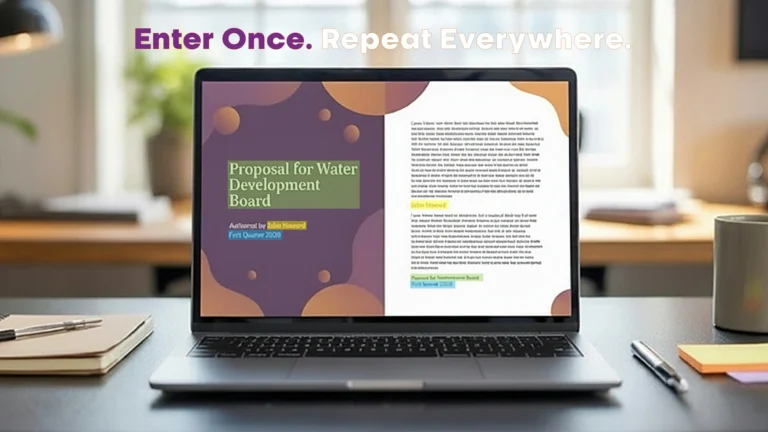
Bring design clarity to your Office files.
If this article has made you rethink how your business uses Word, Excel or PowerPoint, ZOARC Creative can help create polished, brand-aligned templates for letterheads, reports, proposals, bids and presentations.
![]()
When Microsoft began rolling out the new set of icons across its Microsoft 365 suite, the update appeared subtle at first glance. Yet, behind those new gradients and flowing forms lies a complete design repositioning for the AI era. These icons are not simply replacements for the old ones; they symbolise a broader shift in how users interact with their digital tools — from manual productivity to intelligent collaboration.
Design is language, and icons are its punctuation marks.
The entire suite now follows a more fluid, folded aesthetic, with gradients that convey motion and depth. The design language feels lighter, more human, and unified across Word, PowerPoint, Excel, Outlook, and beyond. It reflects the same philosophy that underpins Microsoft’s Copilot initiative — blending human intention with machine intelligence. Each icon now works as part of a cohesive visual family, designed for screens, motion, and accessibility across every device.
For Word, the change feels refined but deliberate. Its familiar blue remains, yet the internal lines within the icon have been reduced from four to three, improving clarity when scaled to smaller sizes. This new form feels more open, giving a sense of precision and balance. It mirrors what Word has evolved into — not merely a document processor, but an intelligent writing environment that assists, edits, and refines. The design communicates focus and clarity, echoing the way users increasingly expect Word to write with them, not just for them.
Word’s blue still stands for clarity,
but now it also stands for intelligence.
For PowerPoint, the redesign brings energy and warmth. The deep coral gradients and the curved folds at the edges create a feeling of motion, as though slides are coming to life. The inner circular fold hints at a lens or a spotlight — a subtle reference to focus and storytelling. It feels less like a static canvas and more like a stage. As Copilot becomes a companion for structuring ideas, summarising content, and generating visuals, PowerPoint’s icon visually reinforces that shift — from slide creation to story creation.
PowerPoint’s new form looks like a story unfolding — dynamic, bright, and designed for narrative flow.
For Excel, the new look brings quiet sophistication. Its layered panels and softened lines replace the rigid grids of older versions. The overlapping green planes now represent analysis and synthesis, rather than mere calculation. It speaks to how Excel has changed — where insights are not only drawn from numbers but discovered through intelligent assistance. The modernised icon captures that sense of depth and data discovery, signalling a tool that interprets rather than simply computes.
Excel’s green now feels analytical yet intuitive — a balance of logic and insight.
Taken together, these icons form a collective visual rhythm — gradients that glide from one app to another, folds that imply connection, and colours that belong to the same tonal universe. They are part of Microsoft’s ongoing goal to unify the experience across devices, ensuring that Word, PowerPoint, and Excel are seen not as isolated applications but as interlinked parts of a single intelligent platform.
The future of Microsoft 365 is not about opening apps, but about moving between ideas.
The design evolution also carries practical implications for professionals who work in template development, document automation, or corporate branding. Visual identity is an essential part of trust, and these new icons subtly redefine what “modern” looks like inside Office environments. A brand or organisation that continues using outdated references in their templates risks appearing behind the curve — even when the content itself is current.
From a practical standpoint, there are several considerations worth keeping in mind:
Why this update matters
Icons influence perception more than most realise; they are visual cues that communicate evolution and progress.
The design system now aligns with AI integration, bridging appearance and function in one consistent language.
Unified icons strengthen user familiarity across desktop, web, and mobile platforms, especially in collaborative environments.
The visual consistency reinforces confidence — users feel continuity even when features evolve rapidly.
For creative professionals, these changes set a new visual benchmark for what modern digital tools should look and feel like.
What to keep in mind for your workflow
Update reference images, help guides, and onboarding materials that still display the older icons to maintain visual coherence.
Review templates, ribbons, and macros that use embedded Office imagery to ensure they reflect the new design language.
Test visual balance in branded templates — the new icons feature more nuanced gradients, which may appear different on various backgrounds or when printed.
Communicate the update to teams or clients as part of brand alignment rather than a software change, helping to manage visual consistency across platforms.
Reassess design choices for simplicity; the new icons work best within minimalist, balanced layouts.
Implications for the creative industry
The new icons represent a growing overlap between visual design and artificial intelligence. As Microsoft continues to infuse AI into daily workflows, design must adapt to reflect that integration.
Creative studios and designers will find value in interpreting these visual signals — using them as reference points for contemporary interface design, motion graphics, or brand system updates.
Updating brand assets to align with the latest Office ecosystem demonstrates awareness of visual culture and technological evolution.
This design shift highlights a movement towards more expressive, humanised software experiences — a direction that design and communication professionals should continue to anticipate.
At ZOARC Creative, such updates are not viewed as superficial but as part of a broader design narrative. Every colour tone, icon shape, or gradient refresh is an opportunity to ensure that templates, presentations, and dashboards look aligned with current standards. It is these details that make digital documents feel modern, credible, and in tune with the environment they exist within.
As Microsoft’s visual language continues to evolve, staying up to date with these shifts becomes part of maintaining brand integrity. A single updated icon may appear small, but collectively these details shape the way users perceive technology — and by extension, the organisations that use it.
Book-a-Call to explore how your Word, PowerPoint, and Excel templates can be refreshed in line with Microsoft’s latest visual language, ensuring your materials feel consistent, intelligent, and future-ready.
Explore more...
- ±5 minutes read
- ±10 minutes read
- ±8 minutes read

- ±7 minutes read

- ±7 minutes read
- ±6 minutes read
- ±5 minutes read
- ±10 minutes read
- ±8 minutes read