Would you see a Heart Surgeon for a toothache? Choosing the right designer for Word, Excel and PowerPoint
to your Office files.
If this article has made you rethink how your business uses Word, Excel or PowerPoint, ZOARC Creative can help create polished, brand-aligned templates for letterheads, reports, proposals, bids and presentations.
Trusted for Microsoft Office template and formatting support

If you had a heart condition, you would consult a cardiologist. For a dental issue, you would see a dentist. Both are doctors, both are highly skilled, but their specialisms — tools, methods, and judgement — are different. The same logic applies to design. Graphic designers and document/presentation specialists are both designers, yet they operate in different environments and optimise for different outcomes.
In many organisations, brand refreshes are led by agencies working in Adobe Photoshop, Illustrator and InDesign — ideal for campaigns, print, and high-impact visuals. But when that brand must live day-to-day inside Microsoft Word, Excel and PowerPoint, a different specialism is required. These applications are not known as primarily design tools, yet they are the everyday workhorses of business communication — and they can be highly effective design environments when set up correctly. Microsoft’s own Work Trend Index shows how much of the modern workday is spent communicating and creating across Microsoft 365 apps, underscoring why the quality of your Office templates has a very real impact on productivity and brand perception.
You would not see a heart surgeon for a toothache. Choose a template specialist when your brand must live in Word, Excel and PowerPoint.
Two designers, two toolsets — and why that matters
A graphic designer’s toolkit excels at composing visuals unconstrained by office-document rules. A document and presentation specialist, by contrast, designs within the rules that govern Word, Excel and PowerPoint: theme colours and fonts, masters and layouts, styles, content placeholders, chart defaults, and accessibility settings. Those rules are not limitations; they are the discipline that makes brand consistency repeatable for non-designers.
This difference in approach is critical. A PowerPoint theme with correctly defined theme colours and fonts flows down from Theme → Master → Layouts → Slides, so everyday users can swap layouts and insert new slides without breaking brand. A Word template with properly defined themes, text styles, building blocks (Quick Parts), and content controls enables authors to produce consistent, on-brand documents quickly. An Excel workbook with governed cell styles and chart defaults ensures numbers tell a coherent visual story every time. These are not academic niceties — they are the practical mechanics of brand governance inside Office.
Graphic designers craft remarkable visuals; Office specialists engineer repeatable systems your whole organisation can use.
The pitfalls of misplaced expertise
A familiar scenario: a great brand refresh is delivered, then the “templates” arrive — a PowerPoint file with a static background baked into the master, a logo pushed into a header, charts that ignore brand colours, and text boxes everywhere. It looks fine in the hands of a designer, but within weeks the business sees off-brand slides and inconsistent documents because the underlying theme, masters, styles and defaults were never engineered.
Nothing here implies a lack of talent; it simply reflects a mismatch between toolsets and objectives. It is rather like asking the heart surgeon to fill a cavity: the principles may be understood, but the execution is not tuned to the specific environment that Office users live in.
Why Microsoft Office specialisation is a strategic choice
Microsoft 365 is a living platform. New features and fixes ship on a regular cadence (Current Channel, Monthly Enterprise, Semi-Annual), and Office apps’ behaviour around themes, styles, and masters has matured significantly over time. Designing for this ecosystem means designing for change — and for how people actually use it.
At ZOARC Creative, our practice began inside Word, Excel and PowerPoint. That grounding matters because the value of template design is ultimately measured not by a portfolio image, but by what hundreds (or thousands) of staff can produce — repeatedly, quickly, and correctly — under real deadlines.
What a specialist does differently (and why users feel the difference)
In PowerPoint
- Establish a robust theme (colours, fonts, effects) and a clean slide master hierarchy so layouts inherit predictably.
- Use content placeholders (not decorative text boxes) to preserve brand typography and spacing.
- Set chart, table and SmartArt defaults to brand colours for “right-first-time” visuals.
In Word
- Engineer Styles for headings, body, lists, captions, tables and code — so users format by choice of style, not manual overrides.
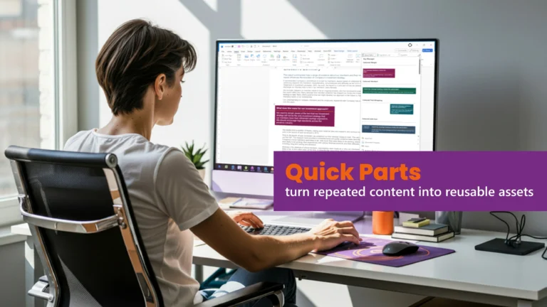
- Provide Building Blocks / Quick Parts for repeatable components (covers, signature blocks, boilerplate), and content controls for governed inputs.
In Excel
- Create named cell styles aligned to brand colours and typography; set chart templates so visuals are on brand without manual tinkering.
Scale and simplification (kept brief as requested)
For large or distributed teams — or senior users who prefer minimal learning — we can add custom ribbon buttons that trigger macros for routine actions (e.g., brand-correct tables, slide numbering, cover generation). A single click replaces multi-step instructions.
The business case: consistency and communication
Consistency builds trust and speeds usage.
Usability research has long shown that consistency reduces cognitive load, improves learnability, and increases perceived credibility — which is exactly what brand systems aim to achieve across channels and artefacts. When your Office templates embody consistent patterns, users produce better output with less effort and customers perceive a more trustworthy brand.
Design quality correlates with financial performance.
McKinsey’s multi-year study of 300 public companies found that organisations in the top quartile of design performance outpaced industry-benchmark revenue growth and shareholder returns — in several sectors by nearly two to one. While this study isn’t Office-specific, it demonstrates that disciplined, end-to-end design (including the everyday artefacts where business happens) is tied to business results.
Poor communication is expensive — templates help reduce it.
Project-level research from the Project Management Institute (PMI) quantified the risk starkly: of the US$135 million at risk per US$1 billion spent on projects, over half (56%) was attributed to ineffective communication. Standardised communication practices dramatically improved outcomes. Well-designed templates are one of the simplest ways to standardise everyday communication.
At an organisational level, SHRM and The Harris Poll (via Grammarly Business) have reported persistent, measurable costs of miscommunication, including estimates of roughly US$12,506 per employee per year. These are not “design costs” per se, but they are precisely the hidden costs that better-structured, easier-to-use templates help to curb.
Why this lands in Microsoft Office, specifically.
Microsoft’s Work Trend Index shows that knowledge workers spend a majority of time communicating and a large share creating in documents, spreadsheets and presentations. If the most-used tools in your organisation are Office apps, then brand-correct, durable templates are a high-leverage intervention for clarity, consistency and speed.
Well-built Office templates turn brand guidelines into everyday behaviour — consistent, accessible, and fast for non-designers.
When the Adobe toolkit does belong
Specialists in Office also use Adobe tools — just with a different purpose. We prepare vector logos and icons, optimise imagery, and export assets correctly (colour profiles, transparency, scaling) so they behave inside Office themes, masters and styles. The creative suite is the workshop; Office is where your teams live. A good specialist bridges both, ensuring assets are technically compatible and easy for non-designers to deploy.
Typical failure modes (and how we avoid them)
- Baked-in backgrounds that fight content: Users cannot switch layouts, and accessibility suffers.
- Manual text boxes instead of placeholders: typography and spacing drift slide-to-slide.
- Charts and tables ignoring brand colours: defaults aren’t set; users “eyedropper” colours inconsistently.
- Word paragraph formatting applied directly, not via Styles: a single edit unravels the document.
- Excel styles undefined: every sheet looks different, and charts are formatted by hand.
- Broken inheritance in PowerPoint masters: layouts don’t pick up theme changes, forcing rework.
Governance, accessibility, and change
High-quality templates are also governance artefacts. They reduce the need for ad-hoc brand policing, support accessible output (contrast, reading order, alt text prompts), and adapt more easily when Microsoft introduces changes. Given Microsoft’s rolling update channels, planning for ongoing stewardship (versioning and release notes) is prudent — and keeps your estate healthy.
Conclusion: the right expert for the right job
You would not see a heart surgeon for a toothache. In the same spirit, if your goal is brand-correct, durable, easy-to-use Word, Excel and PowerPoint templates, choose a designer whose craft lives inside those tools. At ZOARC Creative, we engineer templates that respect your brand and the reality of busy teams — sturdy, practical, user-friendly, consistent, and scalable, with light-touch automation where it makes sense. The payoff is clarity for users, consistency for your brand, and less friction across the work your organisation does every day.
Explore more...
- ±5 minutes read
- ±10 minutes read

- ±7 minutes read

- ±12 minutes read

- ±8 minutes read
- ±9 minutes read
- ±5 minutes read
- ±10 minutes read
- ±7 minutes read