Project overview
Client
Connect Assist
Industry
Contact centre
Service
Word
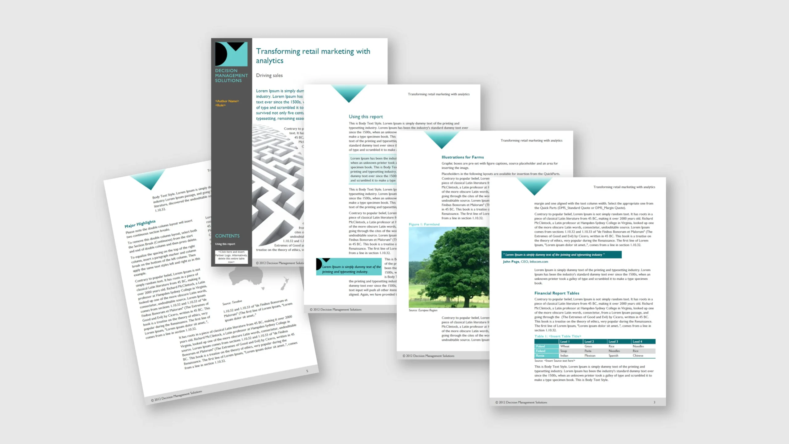
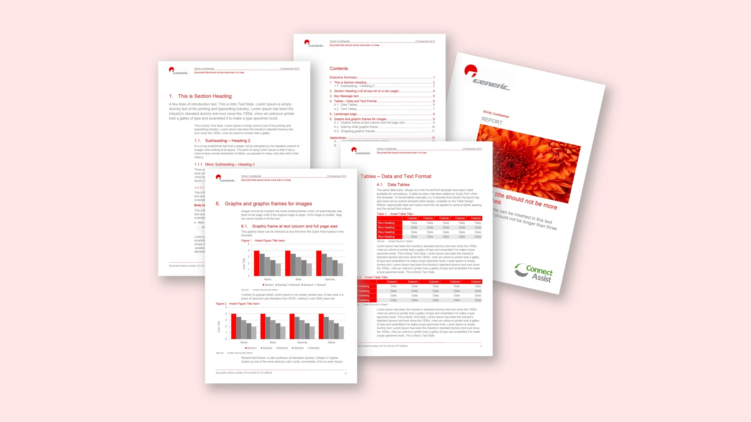
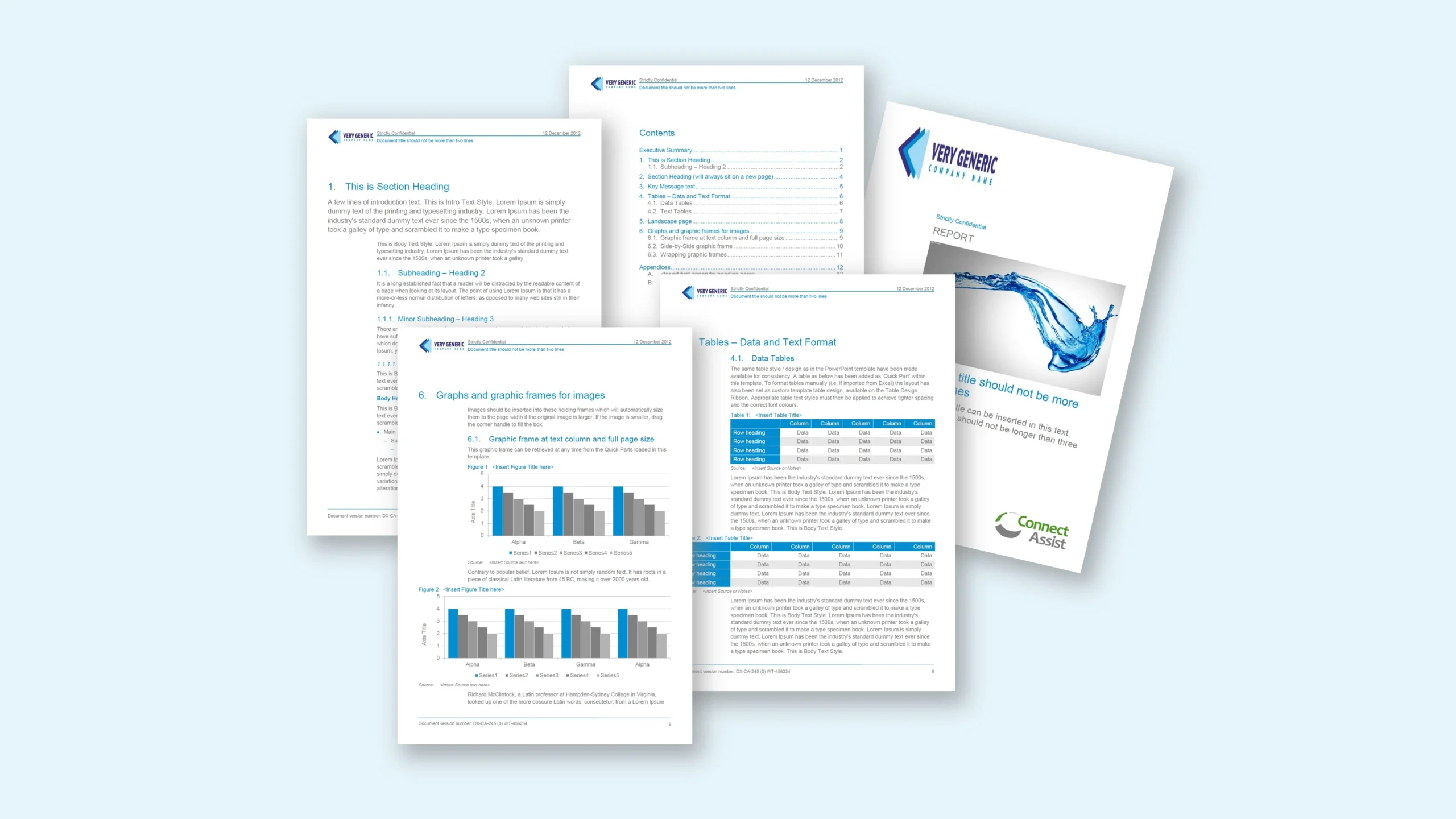
Let’s adapt reports by colour.
Brief
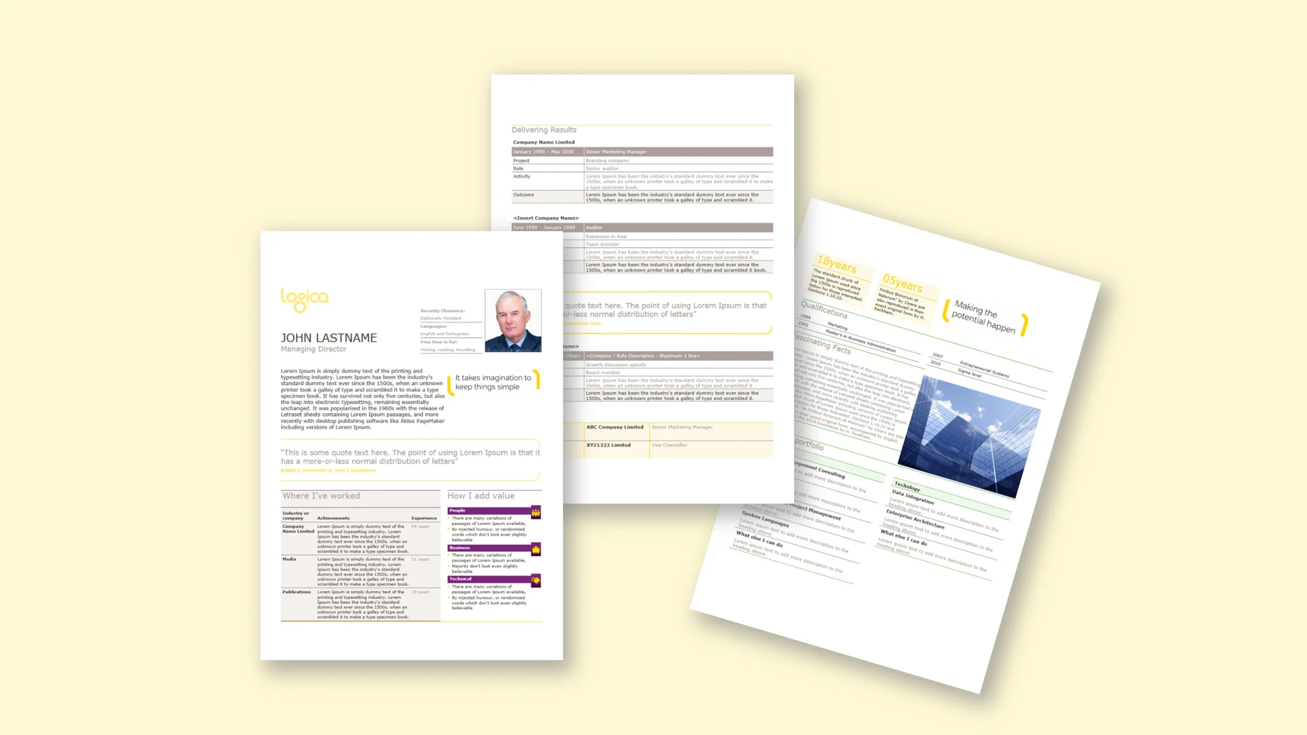
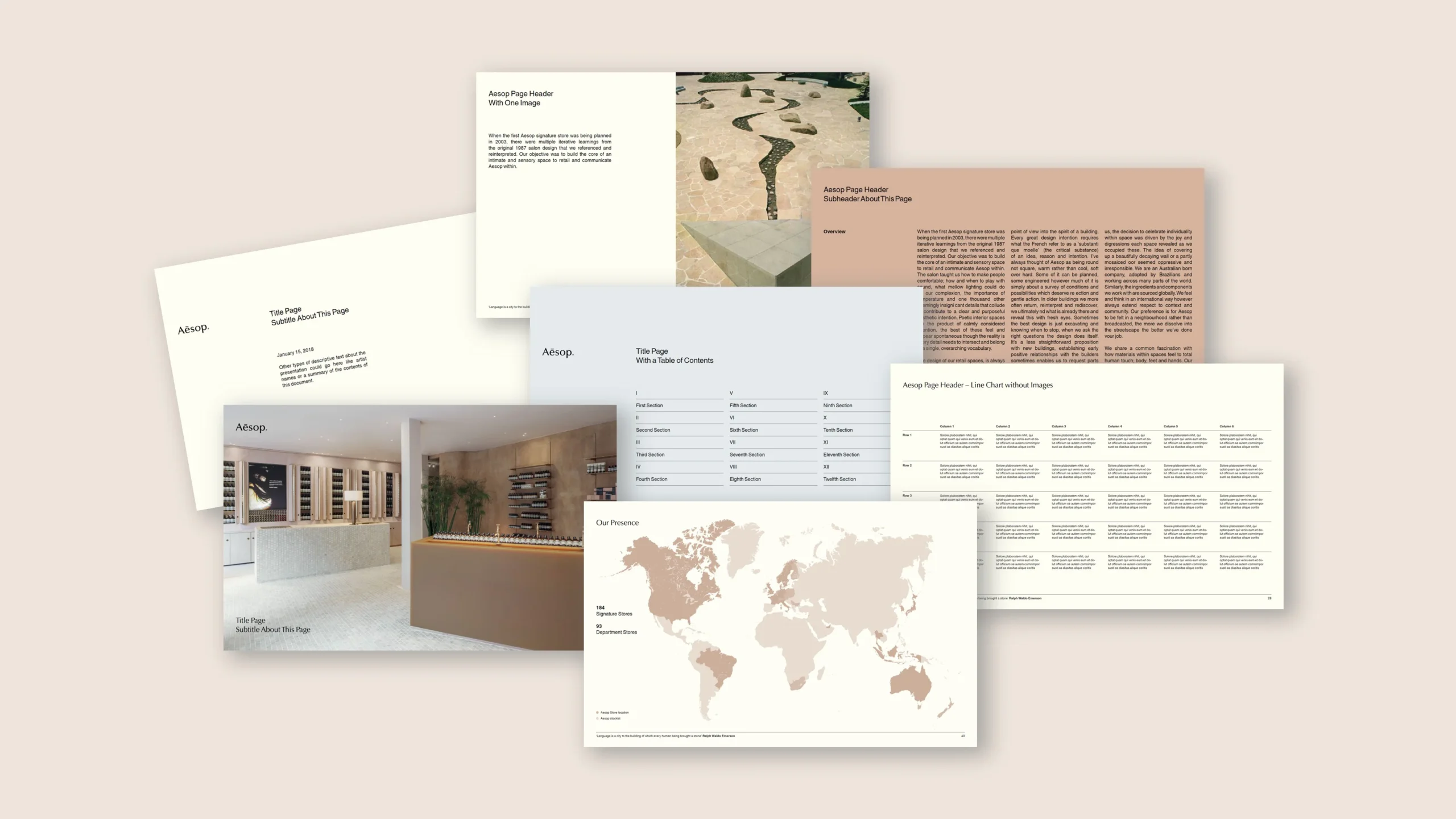
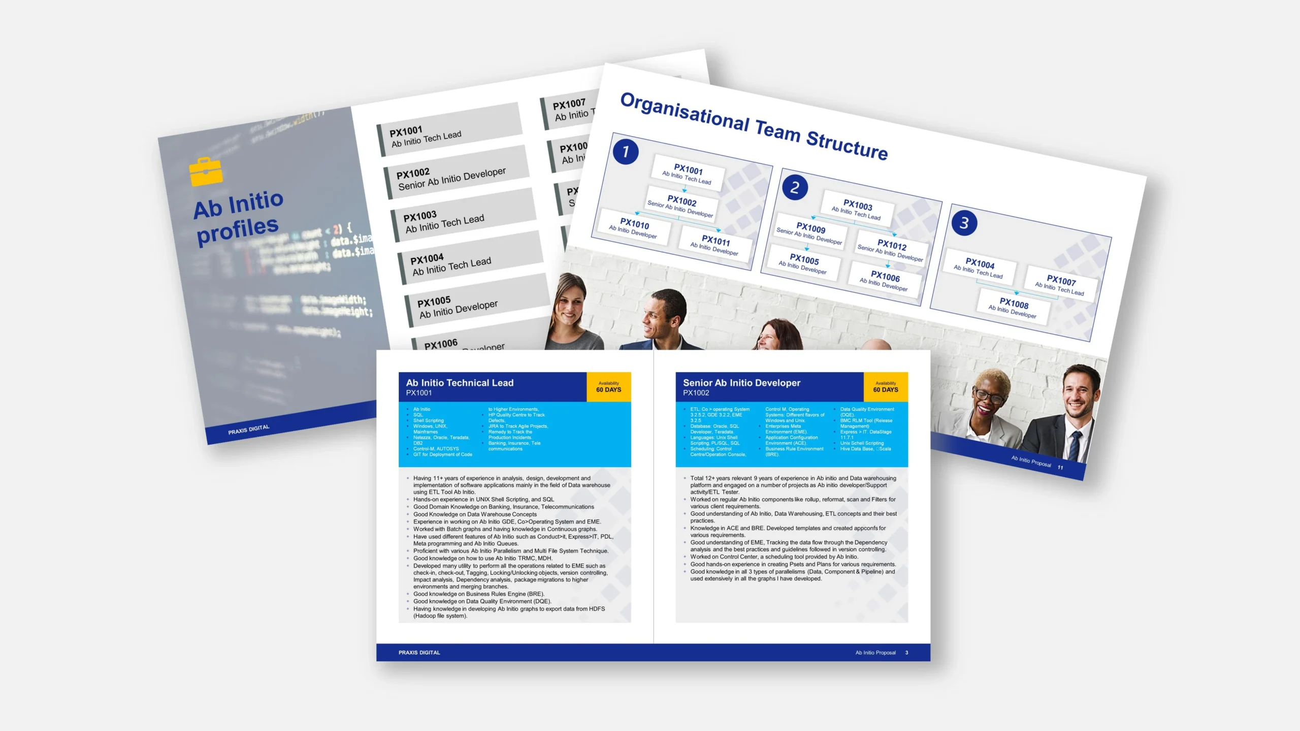
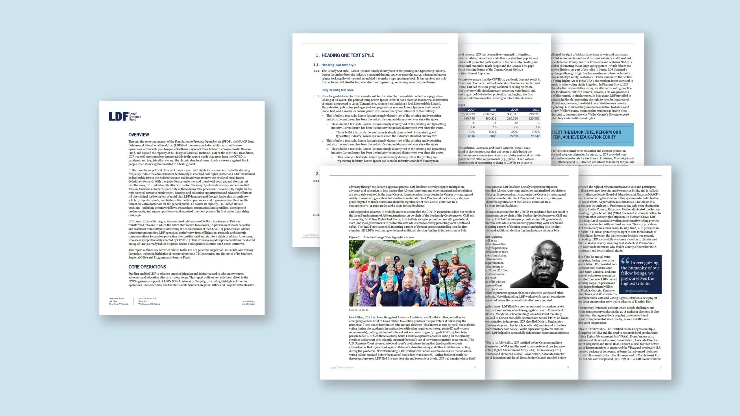
Connect Assist needed a Word report template that could adapt visually to different client-facing reports without creating separate files for every client. The organisation provides specialist contact centre, helpline and digital support services for public sector, charity and socially focused organisations, so reports often needed to feel tailored to the audience. The requirement was not a full rebrand each time; instead, users needed a controlled way to change the base colours of the report while maintaining consistent structure, spacing and typography. We therefore proposed a colour-adaptive Word report template built around Microsoft Word’s theme colour system. By linking headings, tables, charts, dividers, callouts and other accents to the palette, the team could adjust the look and feel by editing the theme colours rather than manually recolouring every element. The aim was a flexible, professional template that gives reports a client-aware appearance, remains easy for non-designers to edit, and exports cleanly to PDF.
Approach
We rebuilt the report as a style-driven Microsoft Word template with theme colours at the centre of the design system. Headings, subheadings, table borders, shaded cells, chart accents, pull-out boxes and section dividers were all connected to defined theme colour slots. This meant a user could update a small set of colour values and the full document would refresh in a controlled way. We avoided hard-coded colours wherever possible, reducing the risk of inconsistent manual edits. The template included structured report pages, contents formatting, headers, footers, body styles, captions and table styles, plus practical guidance on how to change the colour palette safely. Charts and supporting visuals were also aligned to the same theme approach, helping the report feel coherent when client colours were applied. The build balanced flexibility with governance: users could customise the report’s appearance for different clients, while the underlying grid, typography and spacing stayed locked to the template’s design principles. Finally, we tested common report scenarios to confirm that colour changes flowed through the document correctly and that exported PDFs remained crisp and consistent.
Outcome
The team gained a reusable report template that could shift visually from one client context to another without creating multiple template versions. By changing the Word theme palette, users could update headings, tables, charts and accents in one controlled workflow. This reduced manual formatting, improved consistency and gave client-facing reports a more considered appearance. The template remained simple to edit, while the theme-led structure protected layout quality and brand discipline. As a result, Connect Assist could produce tailored reports faster, with fewer formatting checks and a more polished output in Microsoft Word.